Simplify ETFs
Simplify ETFs provide advisors a smart way to build better portfolios. By providing innovative and simple solutions to disrupt the industry, they need a unique and robust visual identity system across all platforms. I work with the team to develop the brand from scratch and continue to provide designs for marketing materials, websites, social media, and motion graphics.
Quick anchor links to the key sections.
Simplify ETFs
Brand Development
Branding Design
Design Direction
Marketing Materials
UX/UI
Social Media Design
2020-Present
Two key points to lead Simplify to be successful: solid ETFs experiences and innovative financial technologies. The logo concept includes these two points as key throughout the design process.


1. The logo idea started from a financial chart

2. Add a half-circle

3. Mark three points from the overlapping area

4. Apply the golden ratio to trim the shape

5. The Simplify logo symbol is born

6. Add the name. The typeface is Mukta
7. Tweak the tail angle from the letter “S” to follow the logo symbol

8. Apply the golden ratio to adjust tracking
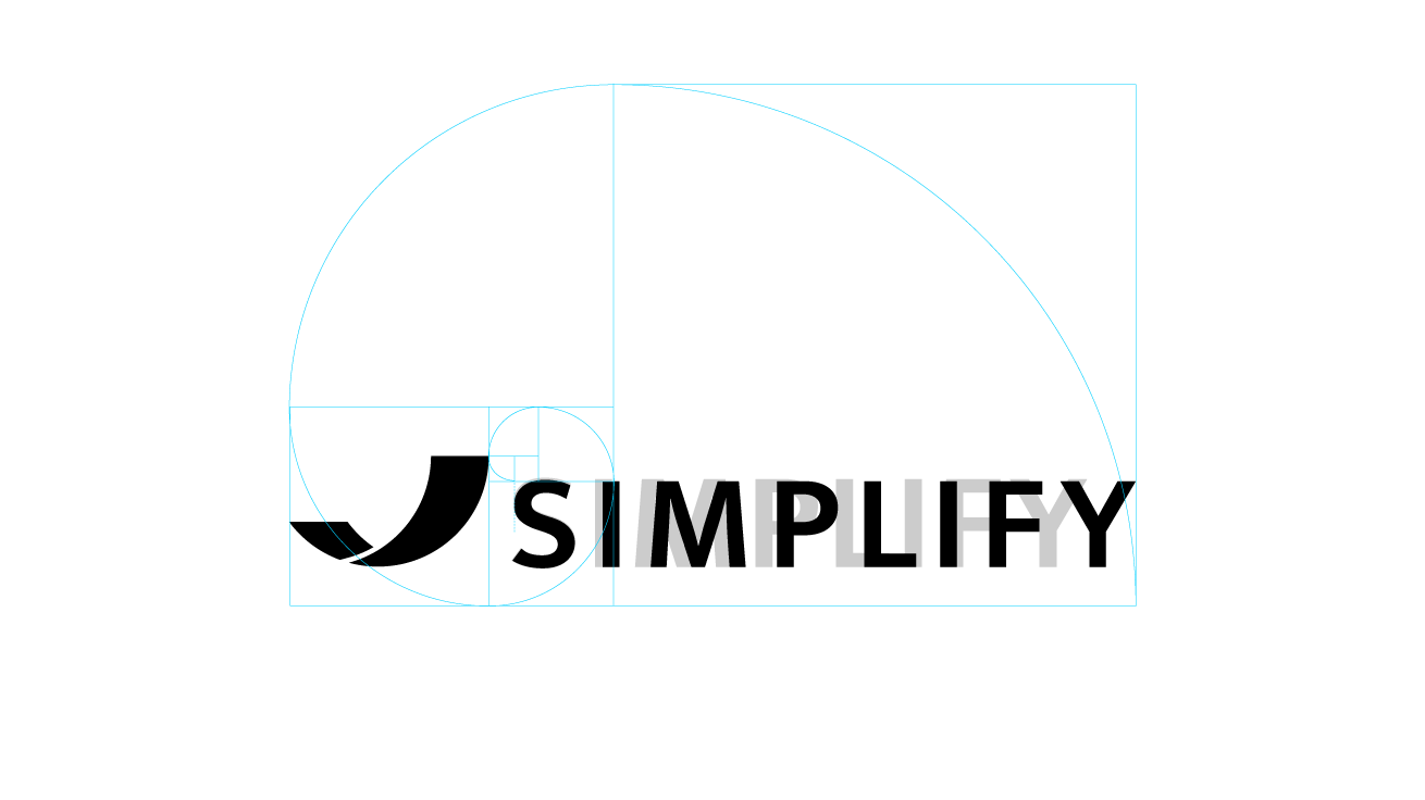
9. The Simplify logo is born
10. A version with ETFs


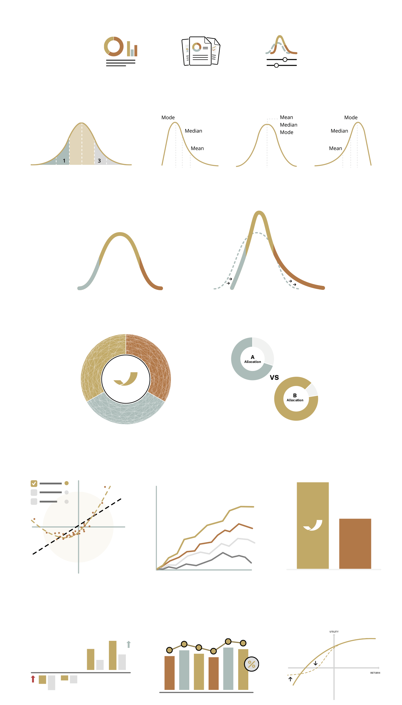
Keep icon intuitive to help users navigating the system. Use relevant illustrations to support the content for easy digestion.
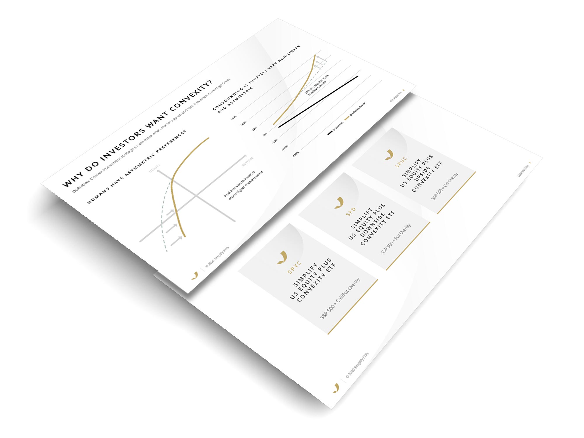
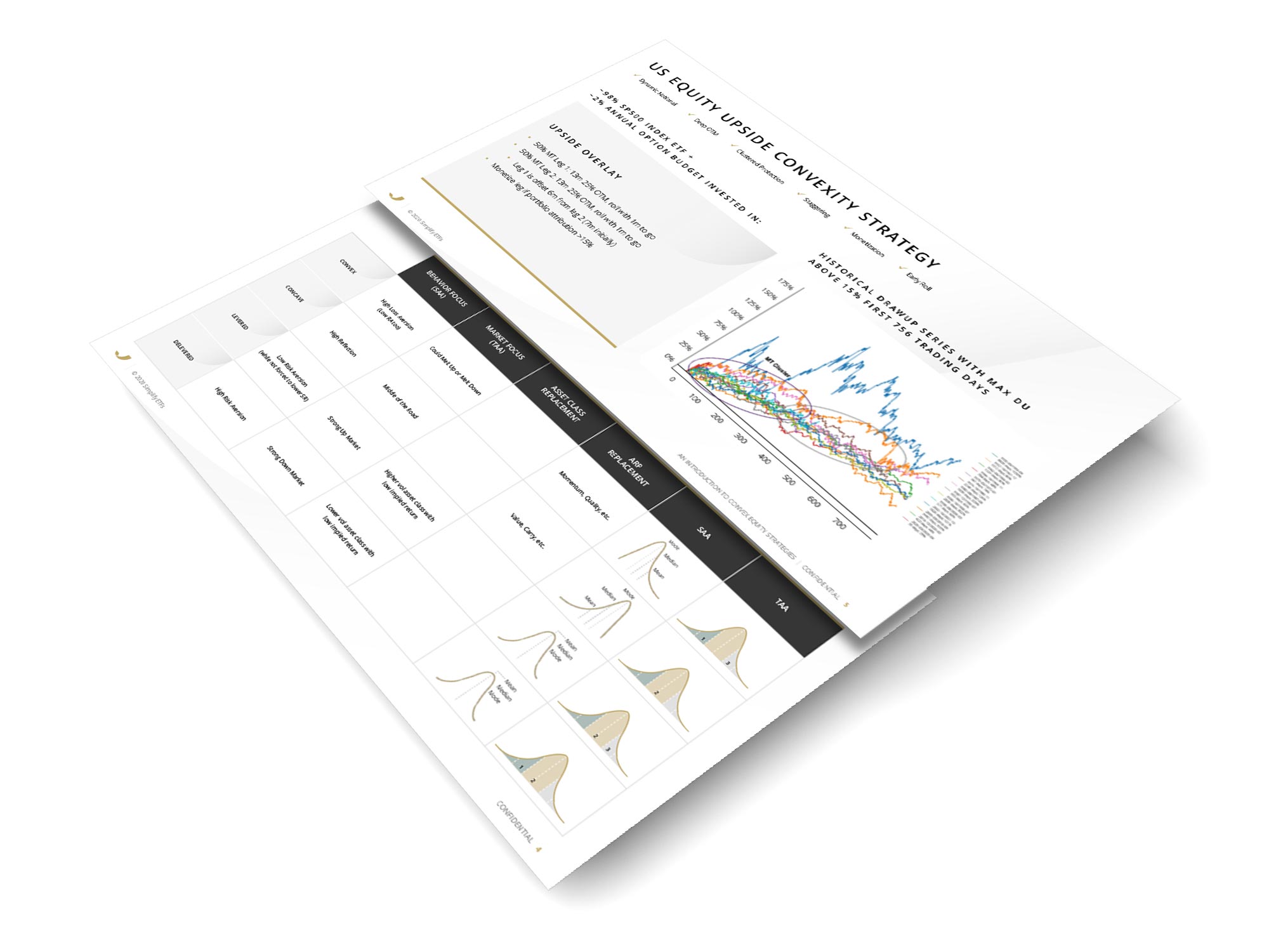
Apply branding to all types of documents to keep them visually consistent and increase brand awareness.


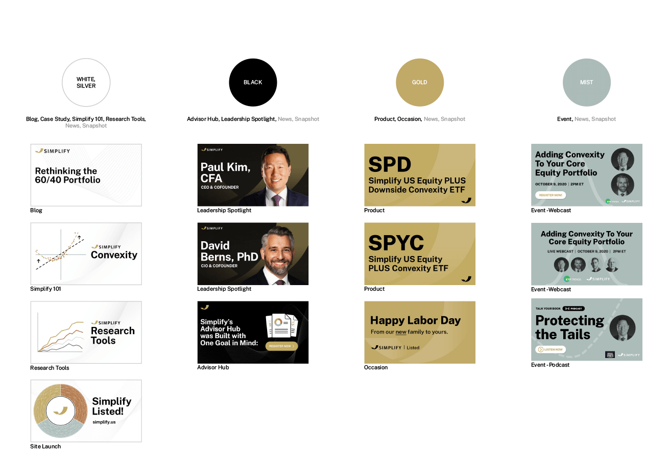
Apply branding to social media elements to increase the brand awareness.

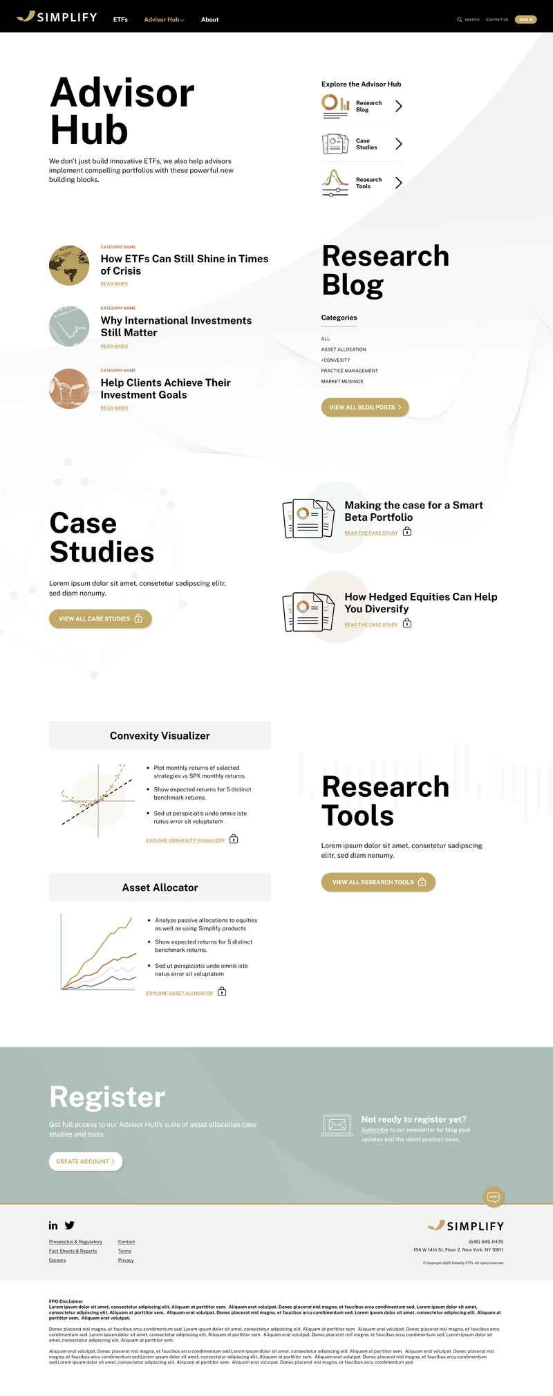
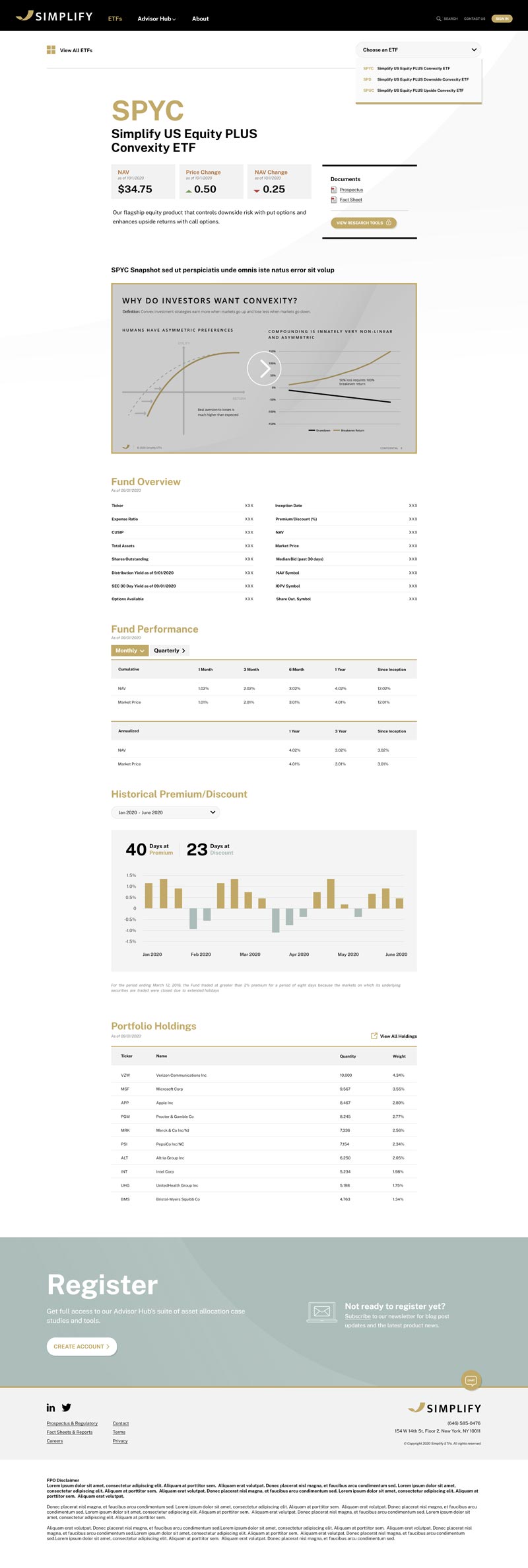
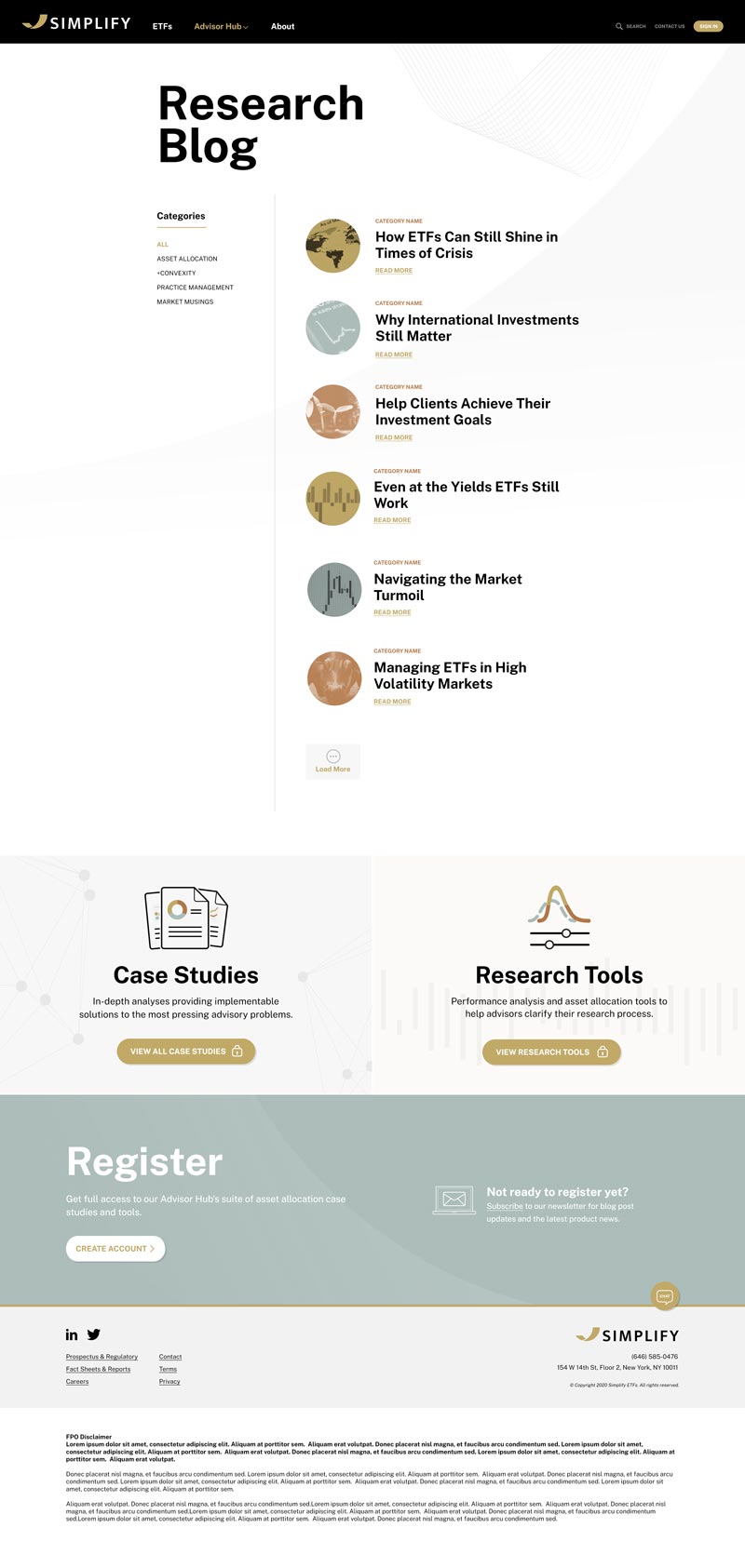
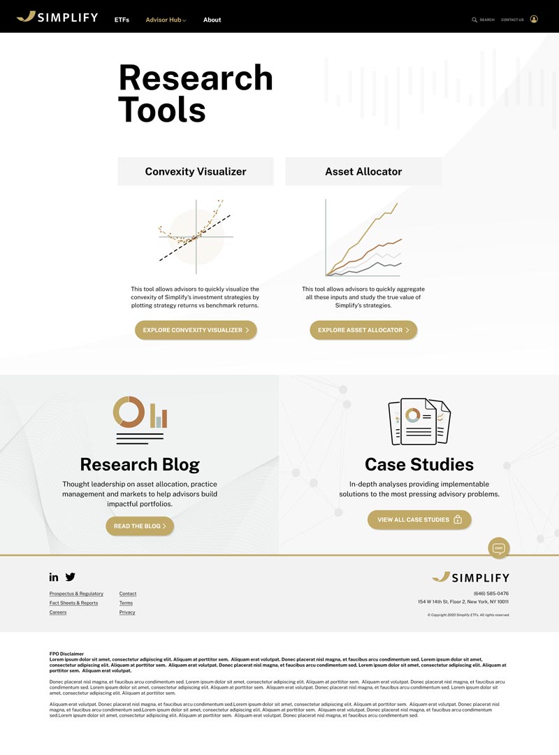
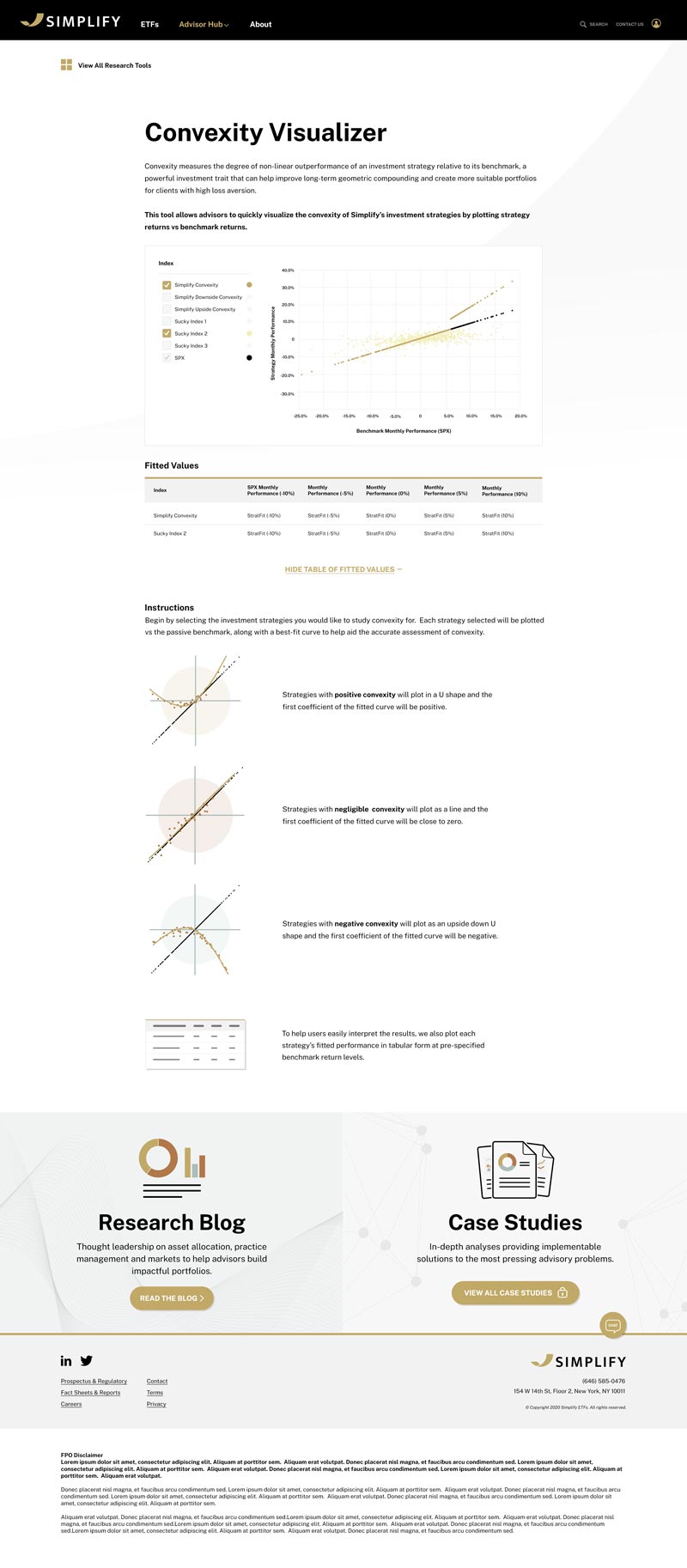
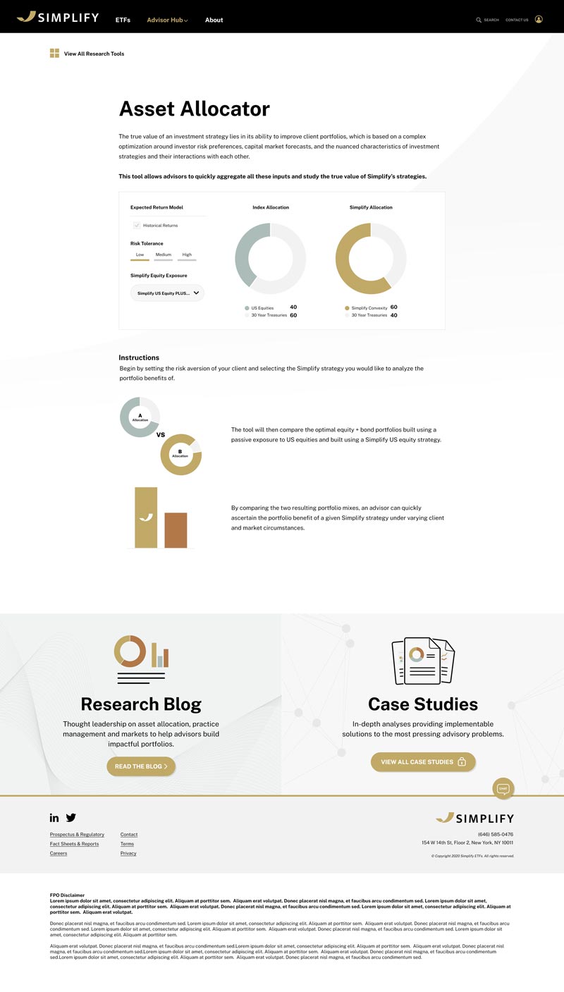
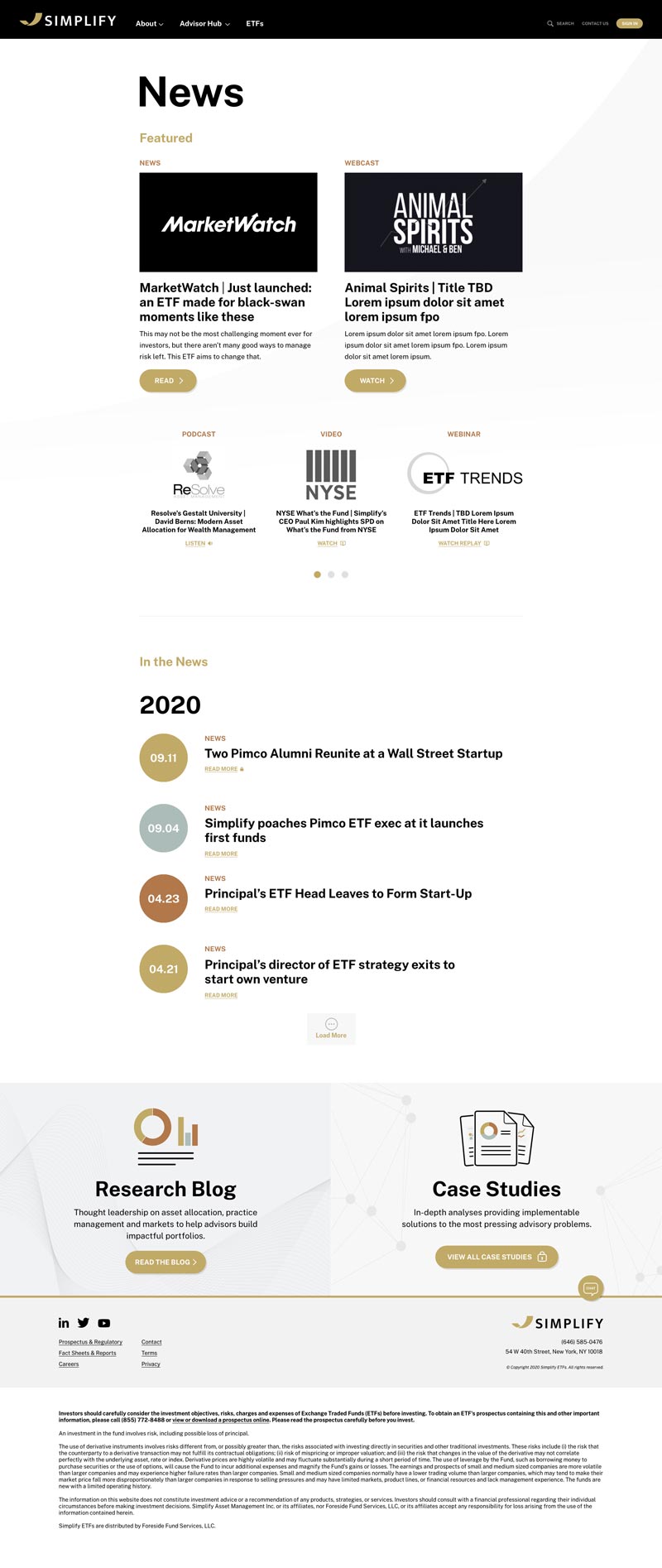
Premium yet approachable, elegant yet simple. The website and widget designs are not only user friendly but also visually can stand out and unique in the industry.


Develop multiple email templates for different marketing purpose.
Create a video for each product for advisors can understand the critical concept for the product efficiently.


