Savoy
As a leader in the wholesale insurance industry, Savoy wanted to reposition themselves to its target audience by offering a professional yet approachable feel on its pre-existing website. I worked closely with both the internal and client team to successfully collect all relevant user experience insights and transfer it to a user-centered yet modern website design to achieve Savoy’s corporate objectives.
Quick anchor links to the key sections.
Savoy
User Research
Brand Enhancement
User Experience
Design Direction
User Interface
Motion Graphics
2018-Present
Desktop: 50%
Mobile / Tablet: 50%
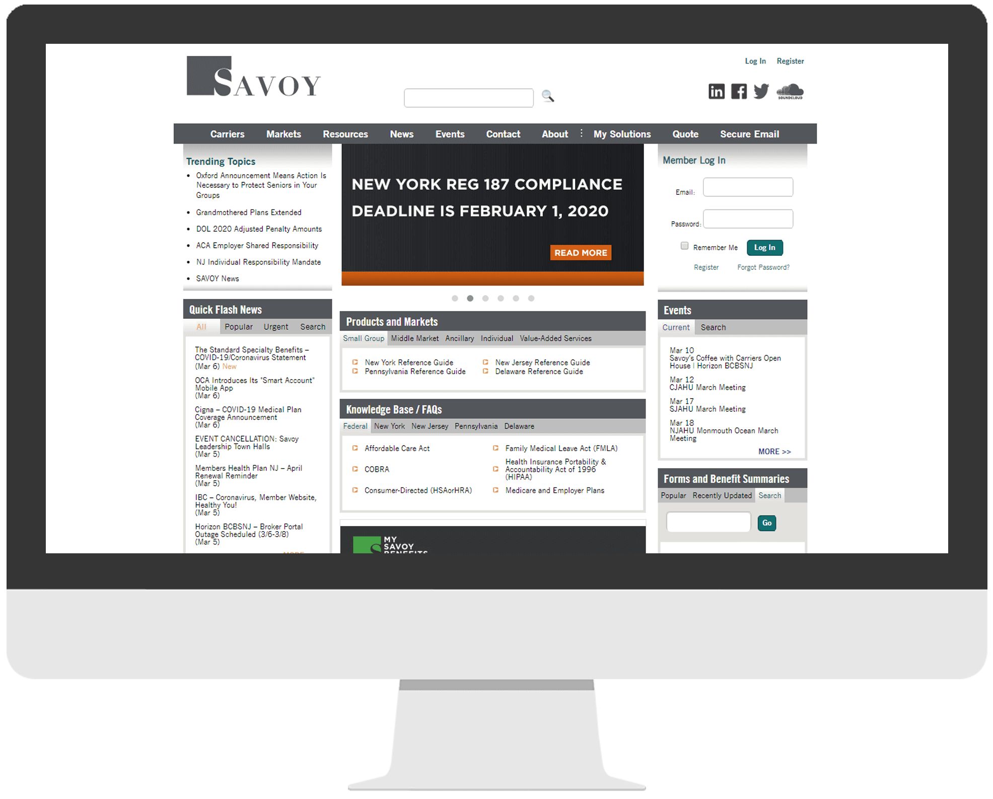
We had the project kick-off with a stakeholder interview and focus group. Their employees represent 30% of the site usage. They mentioned 3 key issues which currently keep their users away from their digital platform that has been caused by inefficient and untrustworthy concerns:
- Slow load times
- Non-mobile friendly
- Lack of search functions
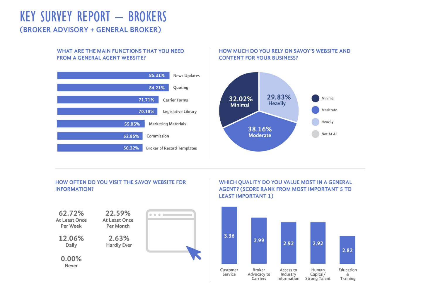
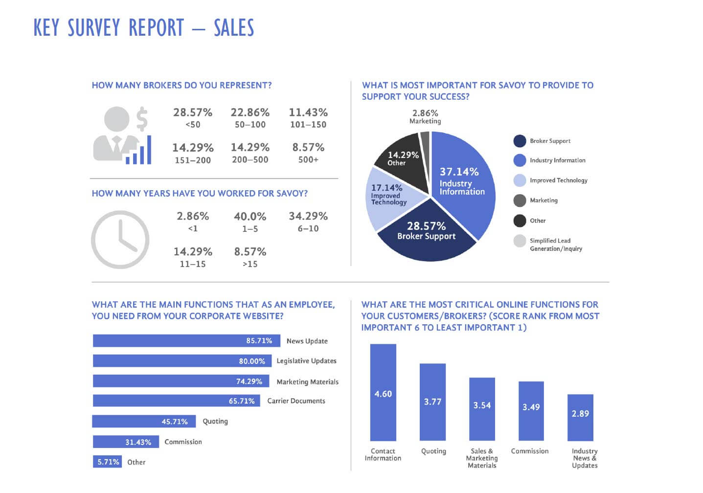
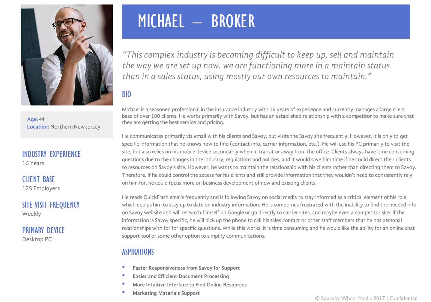
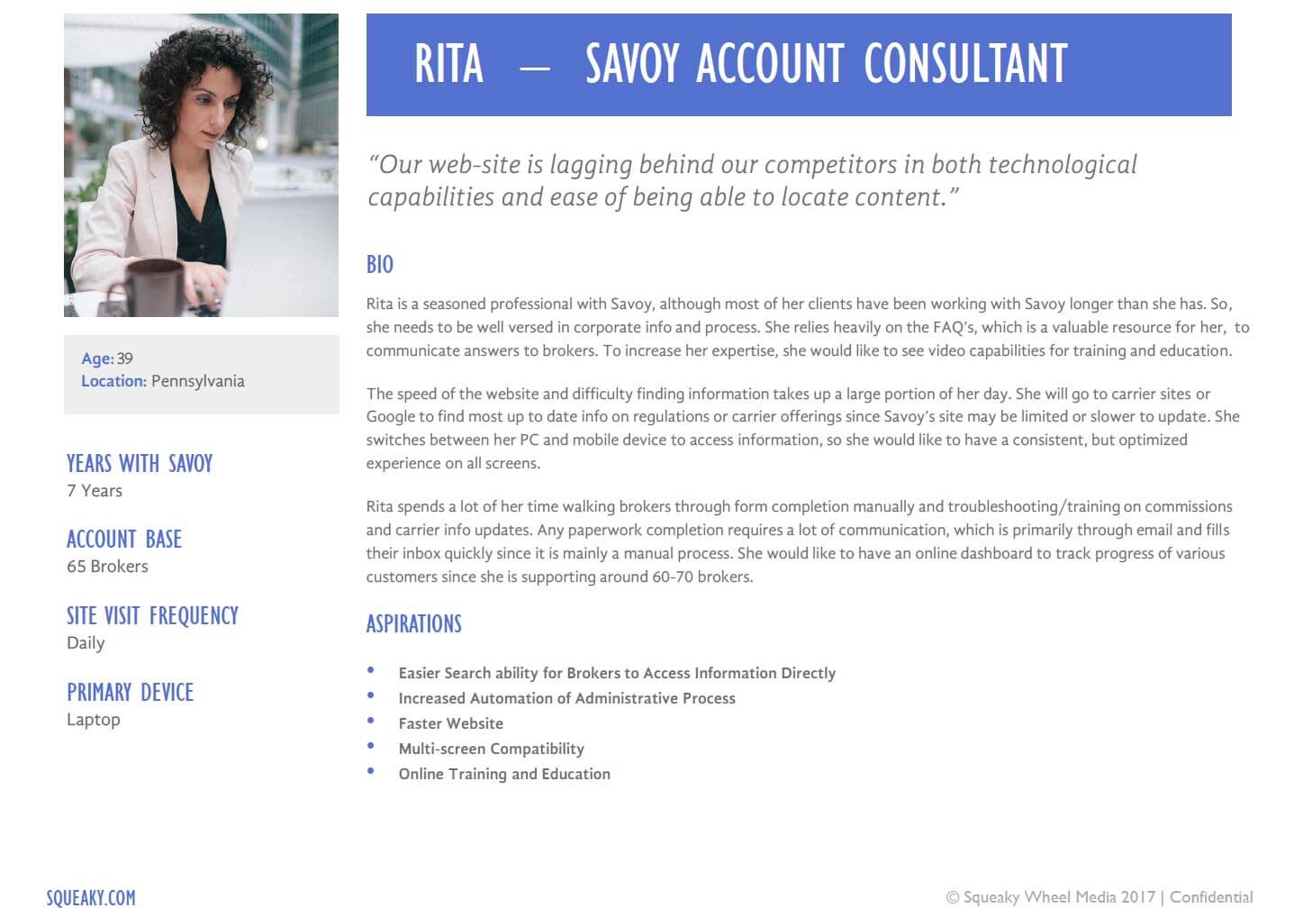
To gain deeper insights straight from the users, I worked with a strategist to develop questionnaires for two key users: Sales and Broker. They represent 70% of the user experience and drive the majority of the company’s revenue.
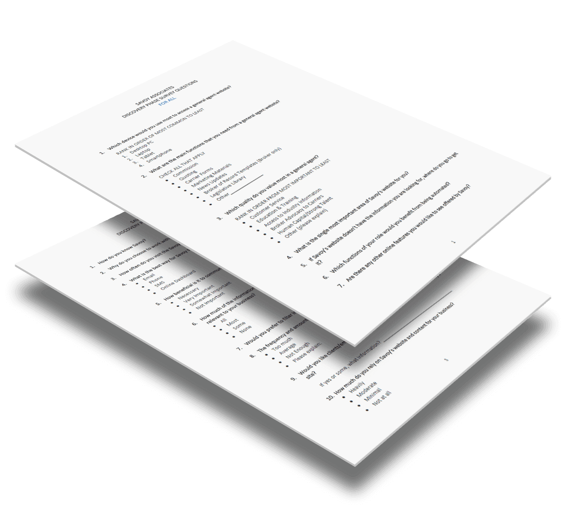
key takeaways from the survey results that apply to the website design: Content is king; Maintain support to its customers and company itself; Improve the document processing; Create a flexible digital platform; Improve the search and navigation.
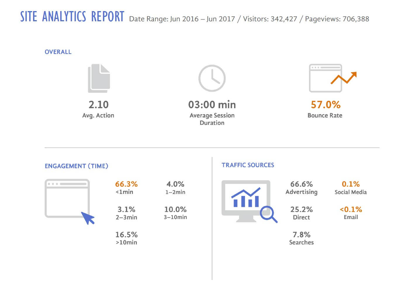
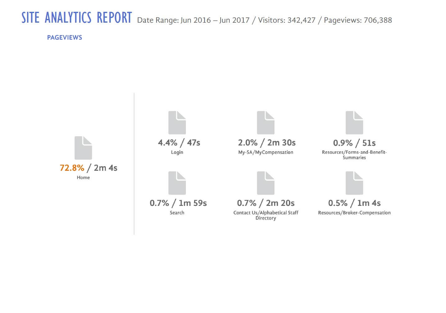
Overall the current users spend quality time on the site contents. However, the site user experience is counterintuitive that caused the majority of users don’t have the 2nd interaction.
Based on all user research reports, I worked with the team to identify key user personas that draw a clear picture of who we are talking to, what’s their goals, and which issues cause their frustration.
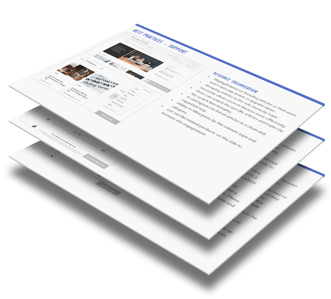
Giving the researcher a clear direction to collect information about what’s the strength and weaknesses of their competitors. Meanwhile, we collect the best practices for each potential key function that could improve the user experience.
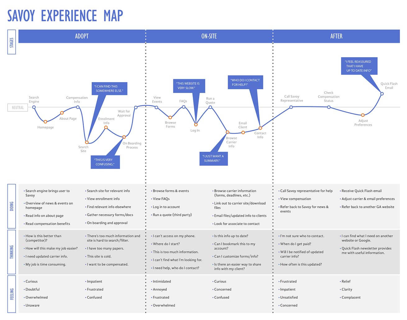
Based on all the data from the user research, we map out a clear user journey and identify each touchpoint to list out all opportunities that give us a direction to find out solutions to improve the marketing message, automation function, customer support, and site accessibility.
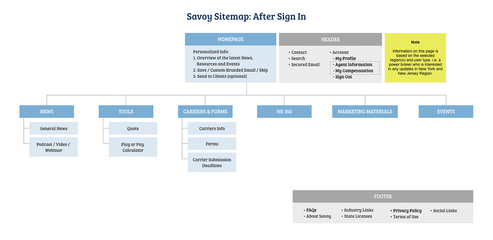
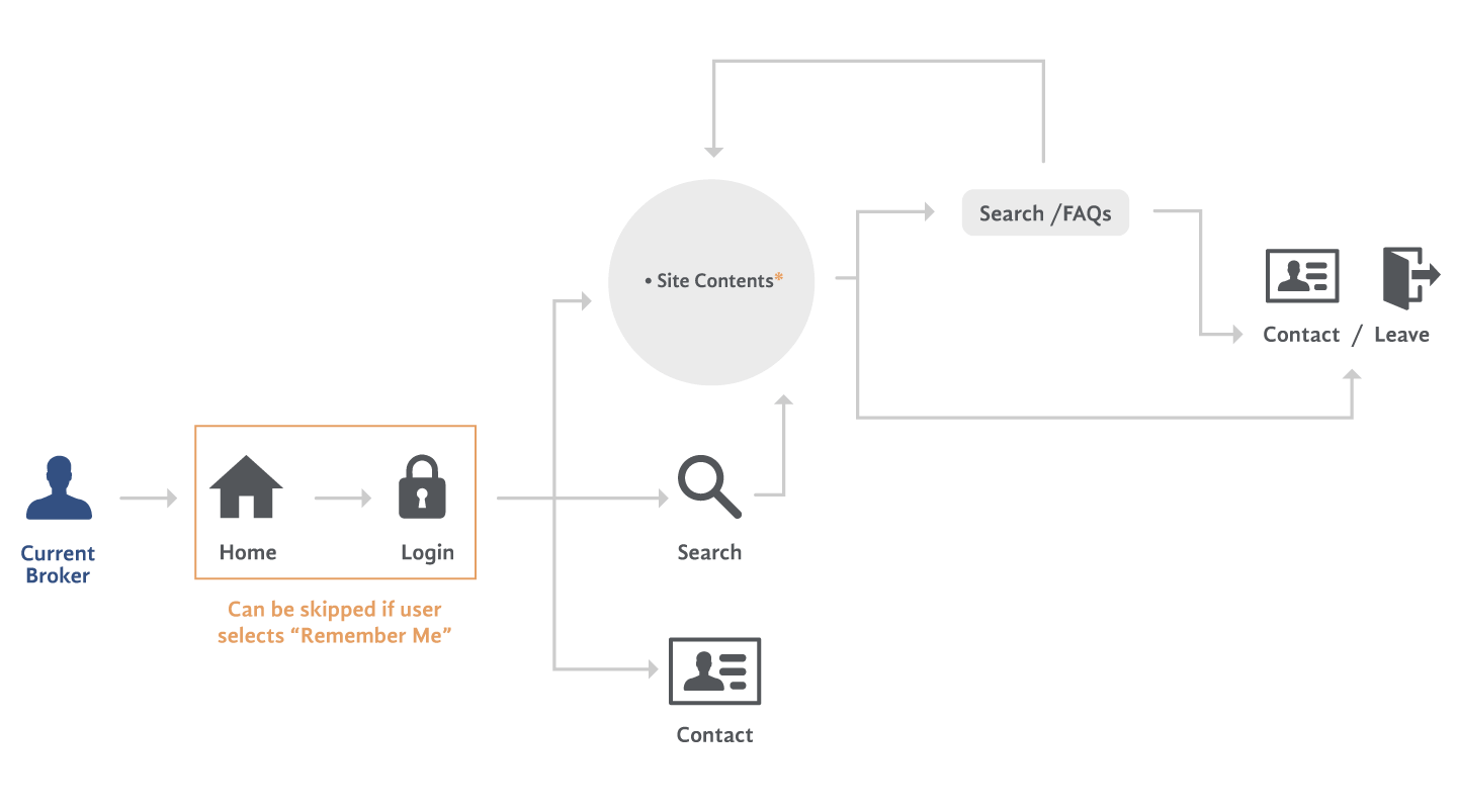
Drawing a future state user flow chart to set a path for designing a strategic user experience design.
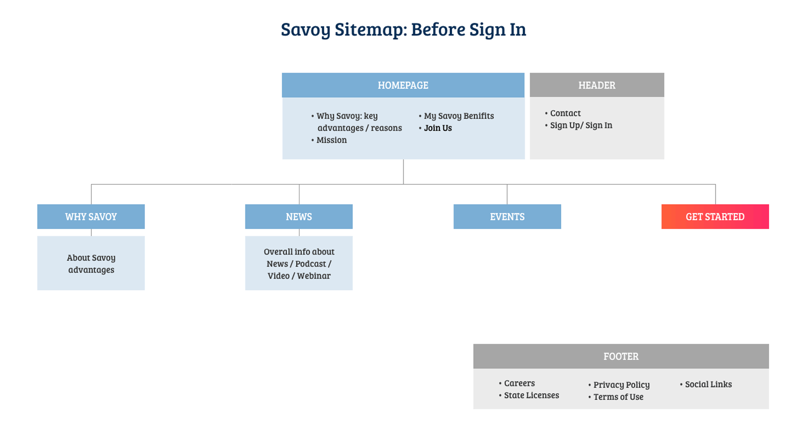
Re-organize the complex site structure to ensure the navigation is intuitive. Leverage functionality that can reduce the click rate to let users find the information they are looking for easily.
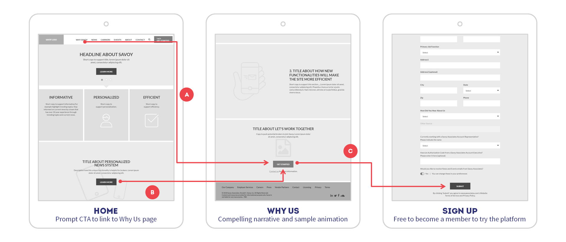
Recruitment – User Engagement
- Design an intuitive navigation
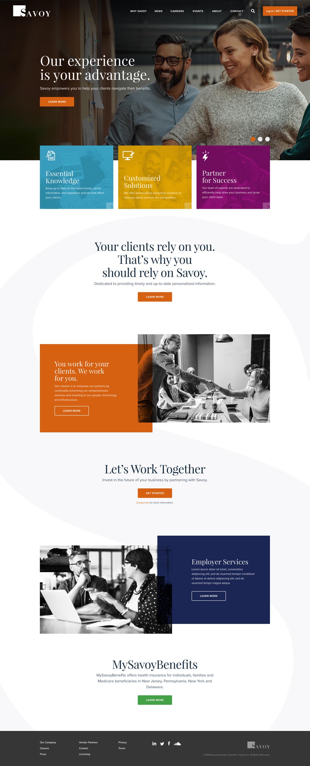
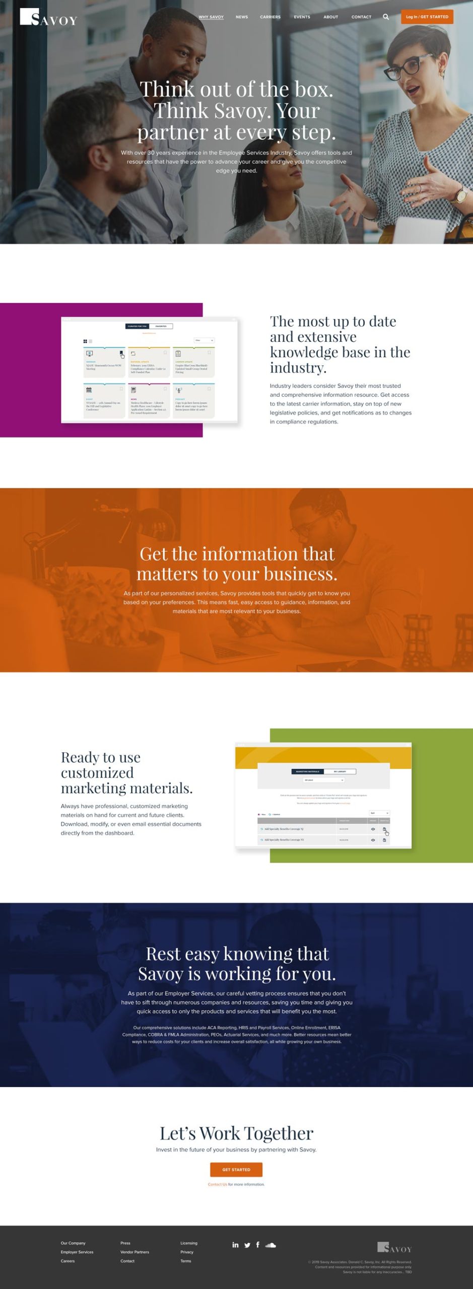
- Engaging message that drives users to learn why they should choose Savoy
- Showing the strong services and solutions that can solve user’s pain points
- The smooth user onboarding process without a tedious procedure
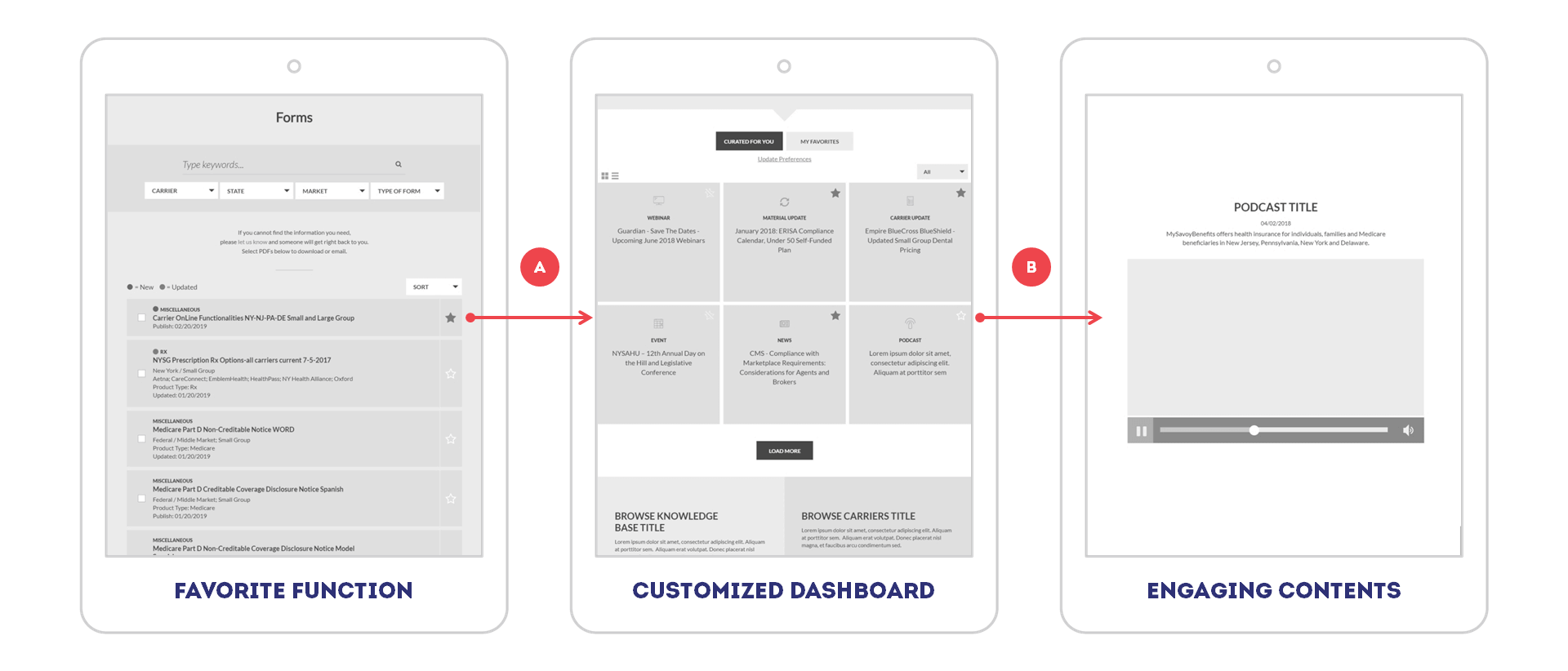
Retention & Conversion – Customized Dashboard
- The favorite function allows users to save the forms, news, knowledge, and marketing materials that they like
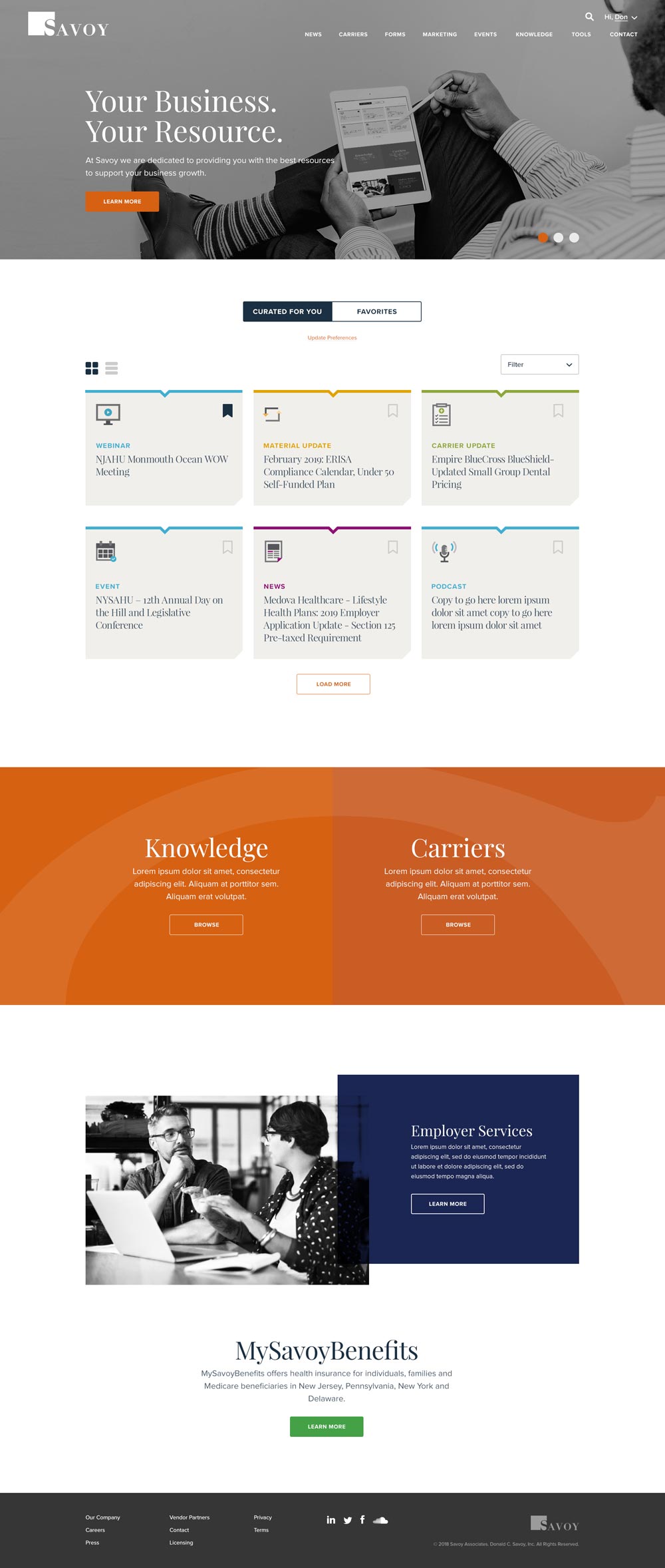
- Based on the user’s preference data, the landing page provides the relevant info in a dashboard format
- Users always get up-to-date info just a tap/click away
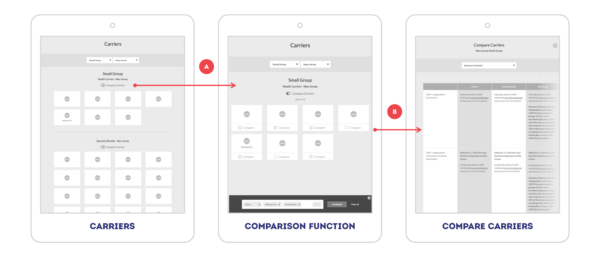
Retention & Conversion – Comparison
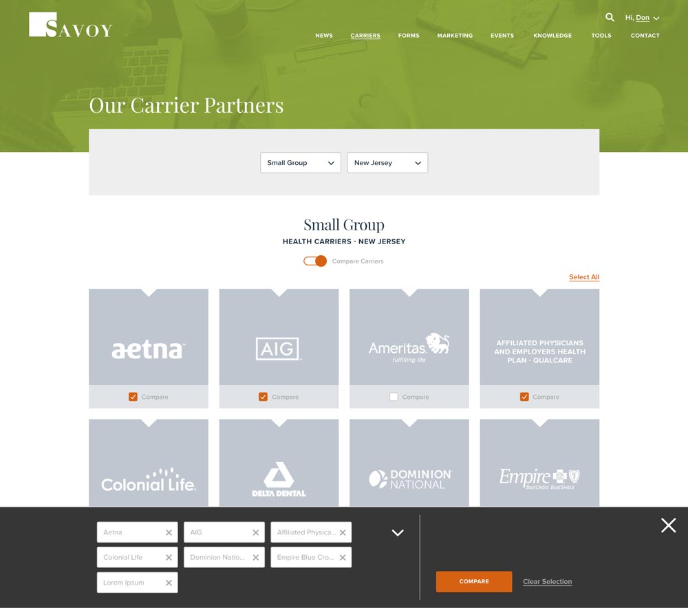
- A card layout with the company’s logo to display carriers in a visually pleasing way
- By leveraging a comparison function to give users a clear picture of the difference between each carrier
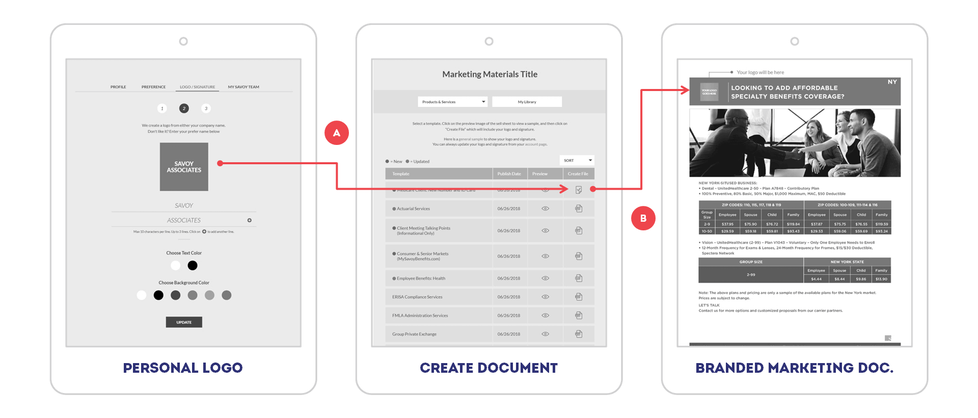
Retention & Conversion – Branded Marketing Materials
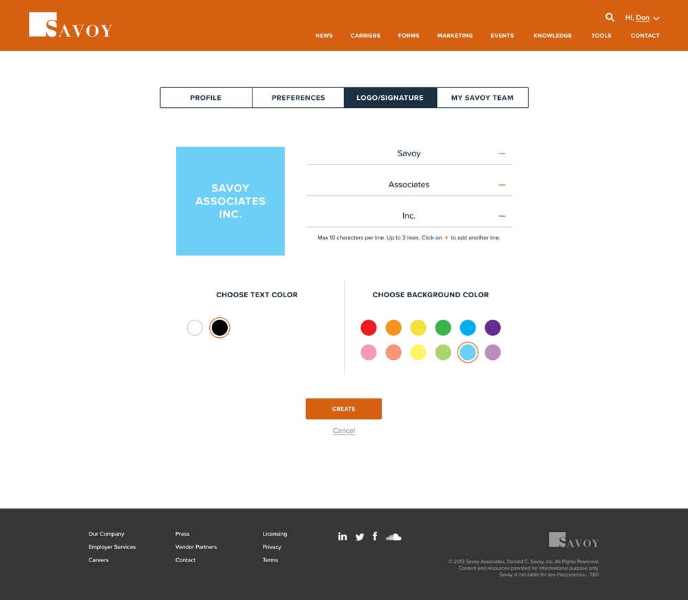
- Allow users to personalize their profile with customized branding
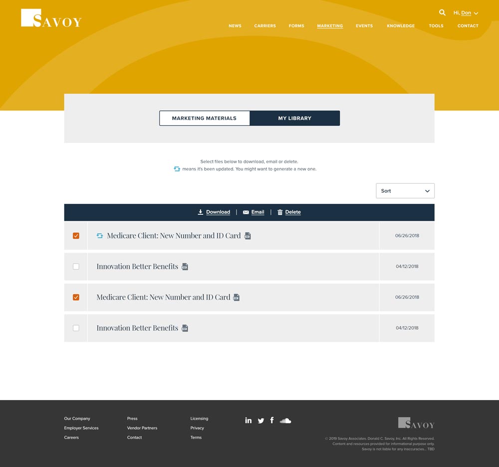
- Provide useful and p-to-date marketing materials
- Allow users to customize the marketing material by adding their logo and signature on it. This customization will potentially let users generate more sales leads.
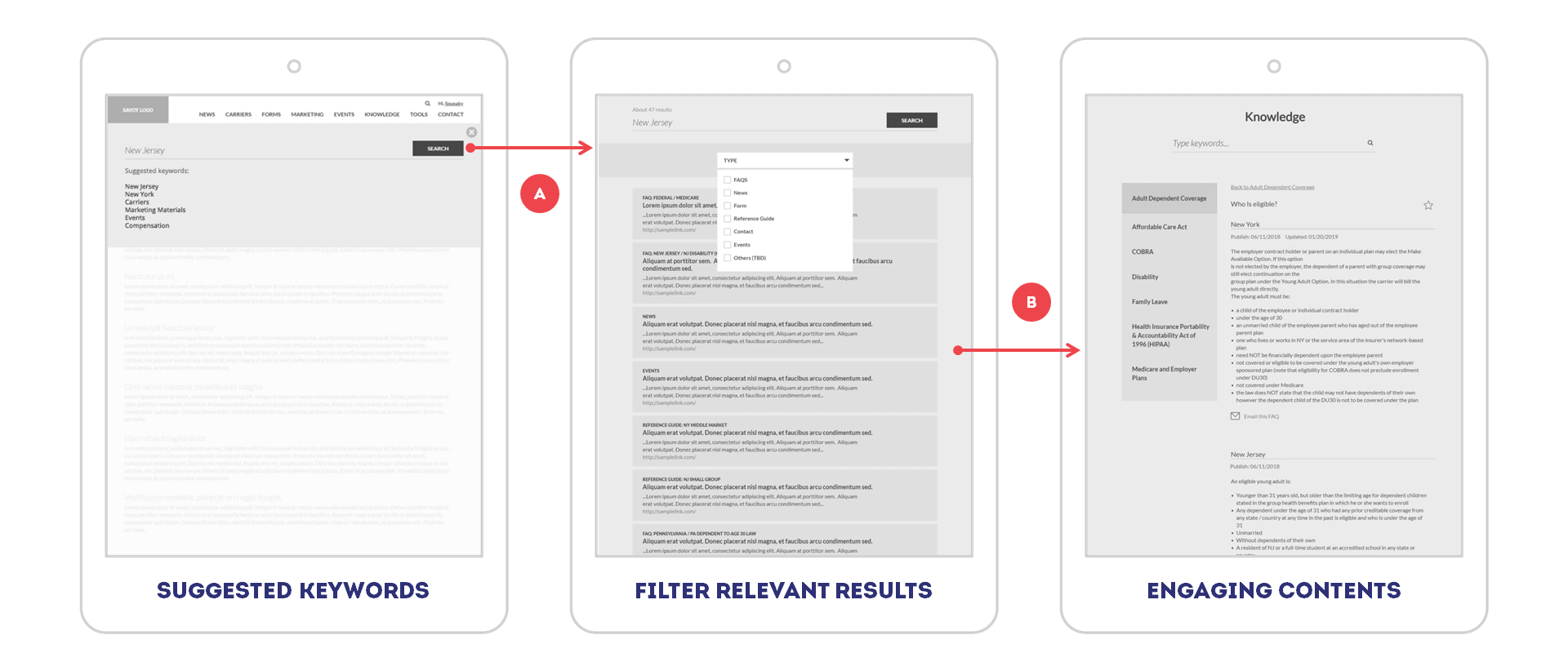
Retention & Conversion – Relevant Search Results
- Suggested keywords to shorten the search time
- Filter and sorting function to narrow down the search results
- The ultimate goal is helping users to find what they are looking for easily
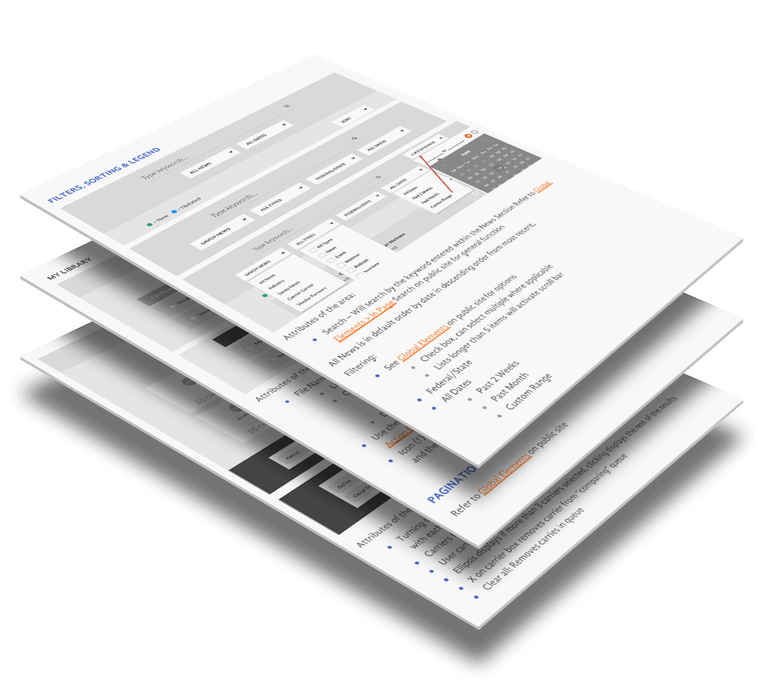
The comprehensive and detailed functional specs document allows the client to fully understand all the functionalities on the site. This document also gives developers clear guidance to work on front-end and back-end development.
Based on the existing branding to provide enhancement on the color and typeface usage for the digital platform.
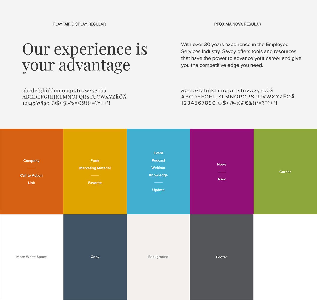
Following the branding to provide a unique set of iconography that can use for both online and offline platforms.
A customized dashboard that is based on the user’s preference and it allows the user to always get up-to-date information just a tap/click away.
Click on video to play.
A handy and intuitive function to let users save, download and send whatever information is useful for them.
Click on video to play.
Provide useful marketing materials and empower Brokers to add their branding on the materials that will help them to increase sales.
Click on video to play.
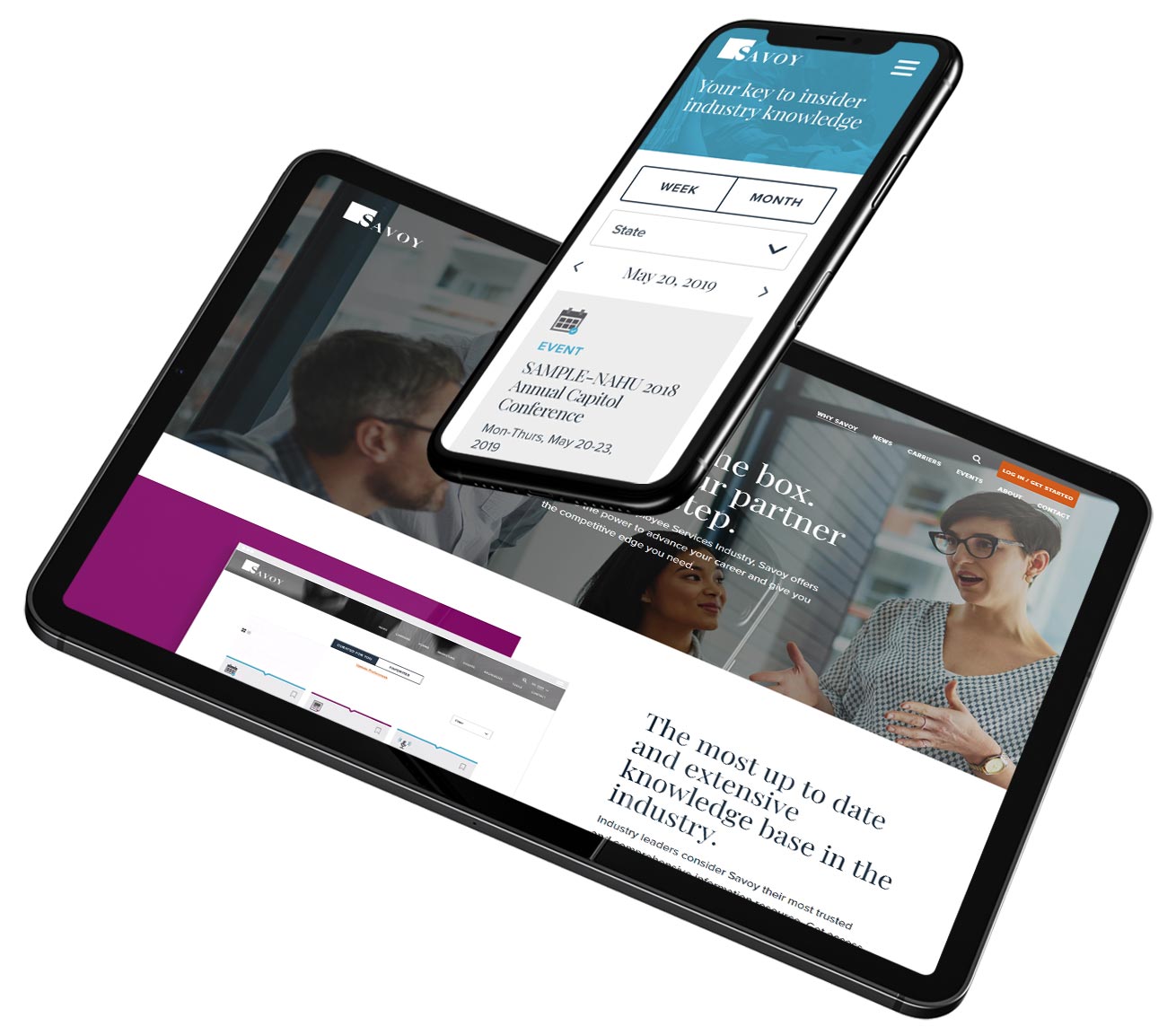
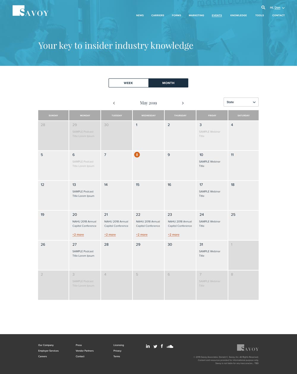
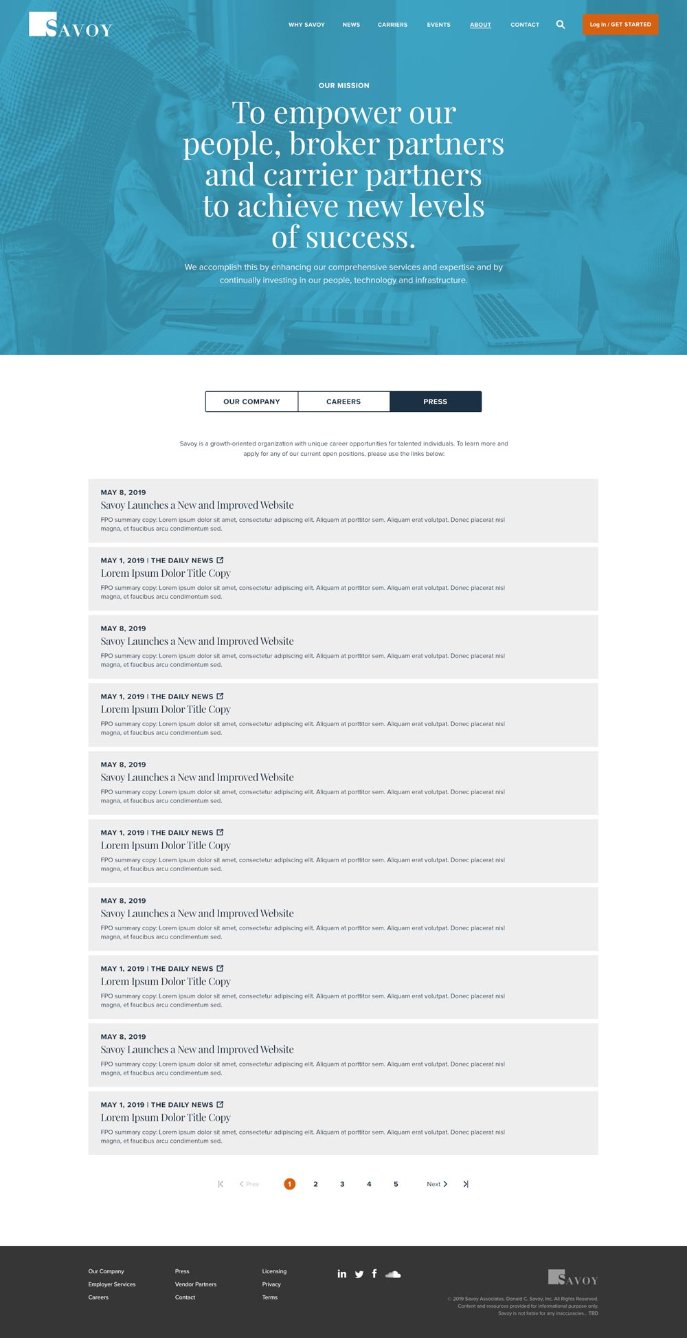
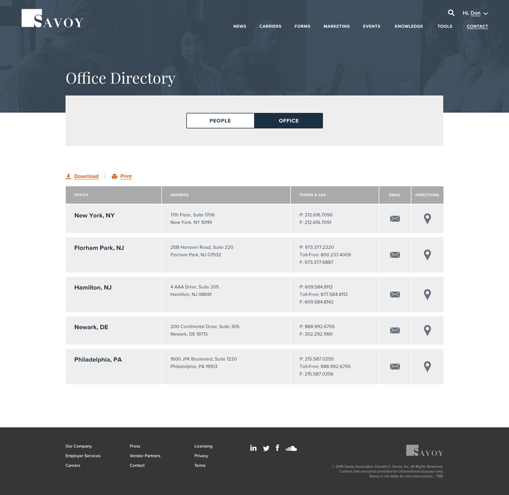
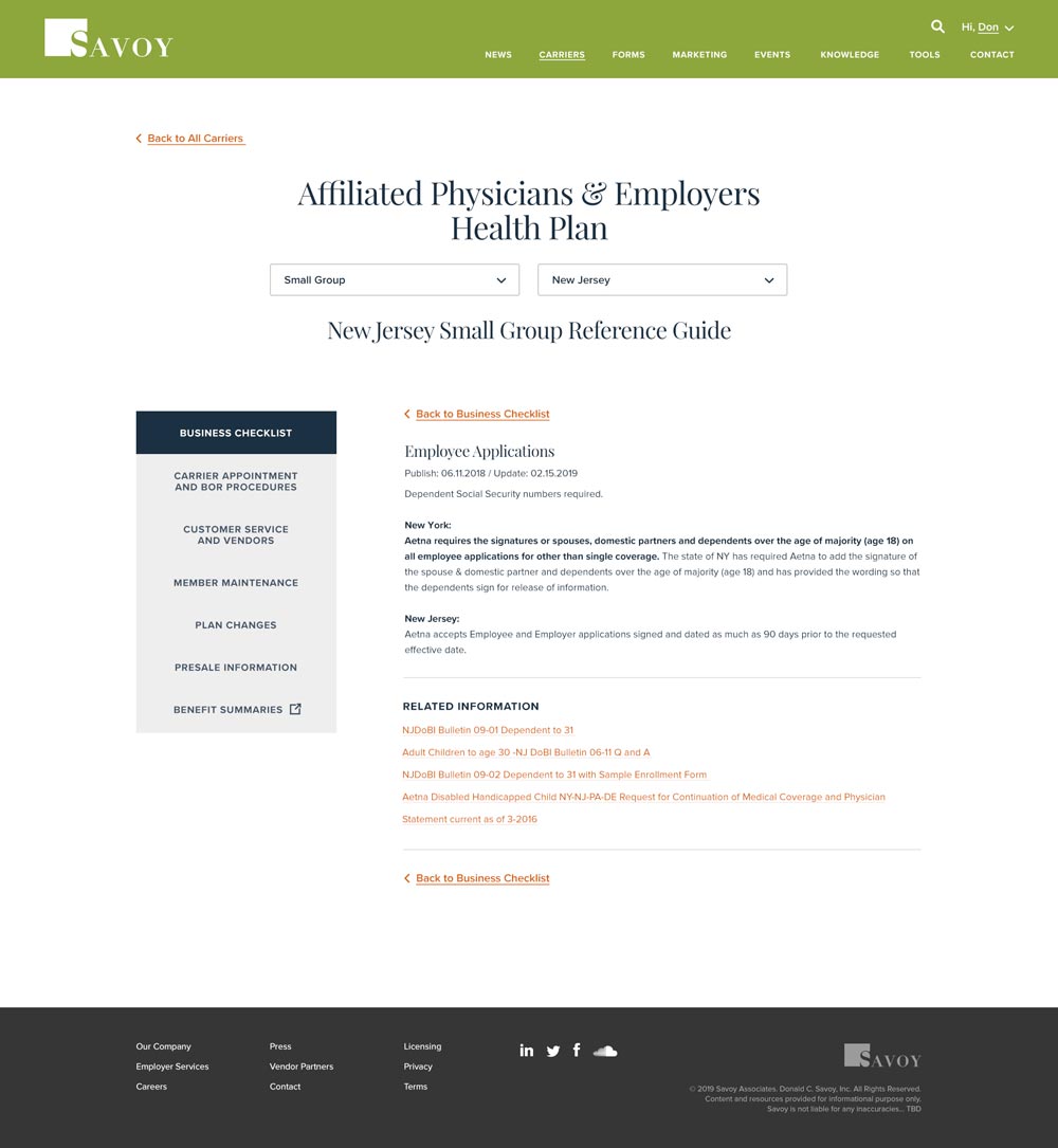
The user-centered and mobile-first design to let target users use this powerful digital platform no matter where they are.
Click/tap/Scroll/swipe the screen on mobile to browse the mock-ups.

