I Had Cancer
I Had Cancer (IHC) is an online cancer community site which helps cancer fighters, survivors, and supporters to get strength and experience from each other. As a three times Webby Awards winner and one of the most impactful cancer community websites, IHC wants to engage more users who can get as much as helpful information and support from the site intuitively.
I Had Cancer
User Research
Brand Development
User Experience
Design Direction
User Interface
Motion Graphics / Video
Social Media
2011-Present
Mobile / Tablet: 65%
Desktop: 35%
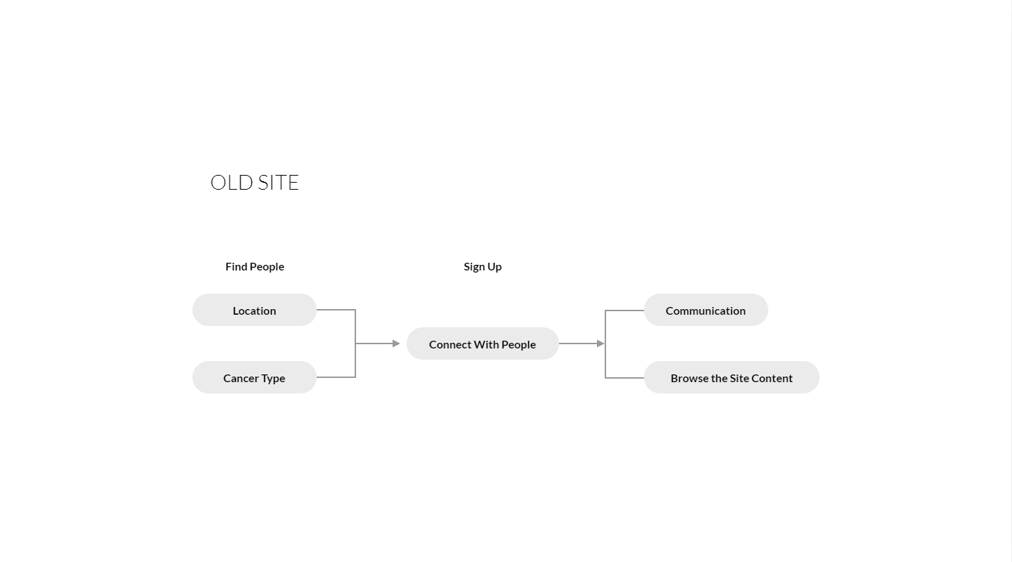
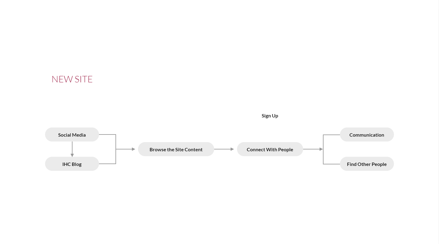
When we first designed the IHC site, we thought the best way to connect users is to create a robust search function to find users by a similar type of cancer and a location close to you. After two years we launched the site, there is no good improvement for the conversion rate. We found 3 major issues that we learned from users through the online survey:
- Privacy concerns
- Can’t identify if other users’ account is real
- Prefer not to connect with other users without knowing more about them

In the first step of the website re-design, we asked members and their connections to help us doing a massive online survey. In addition, we also invite some core members to join a couple of focus groups. It’s important to collect as much user’s behavior data as we can before getting into the analysis step.

The purpose of the IHC platform is to help cancer fighter, survivor, and support at any stage of the cancer journey by providing useful info and relevant connection. We did thorough research from the online resources and interviewed couple members from the IHC community. The goal is to consolidate users’ journeys into key touchpoints so that we can adjust the platform structure for better user experience.
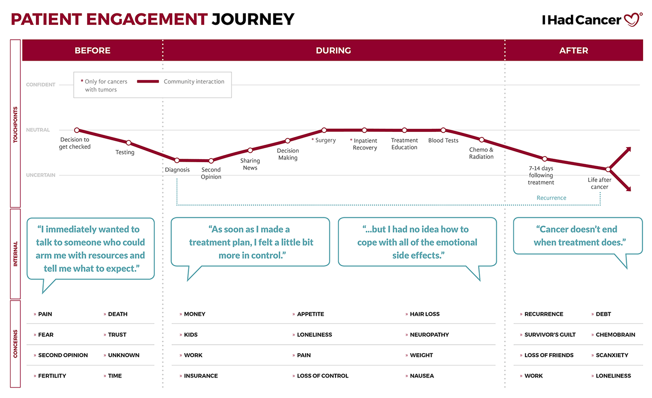
Update the user flow based on the real user behavior to improve the engagement and conversion rate. Here are key takeaways from the user research and data analysis:
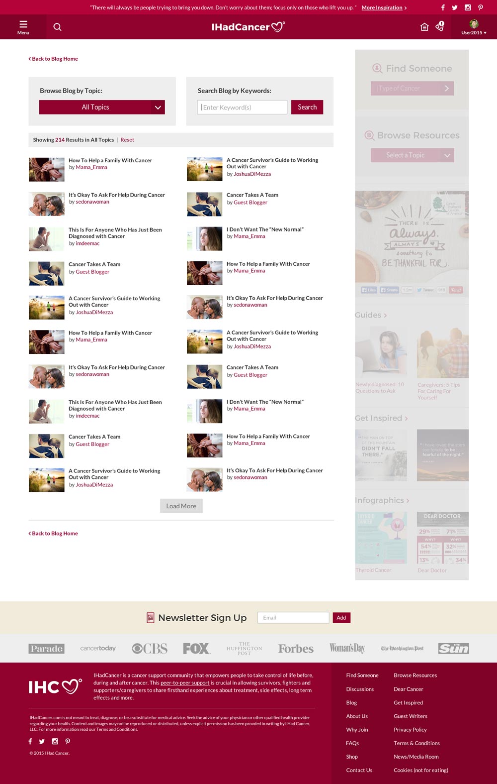
- The highest engaging section over the platform is Blog
- The highest user acquisition channel is Social Media
- The most engaging social channel is Facebook
- Users most likely connect with people who have ever written articles, notes, or comments on the platform
Logo re-design. Typeface and color refreshment. The goal is to increase warmth and personality.
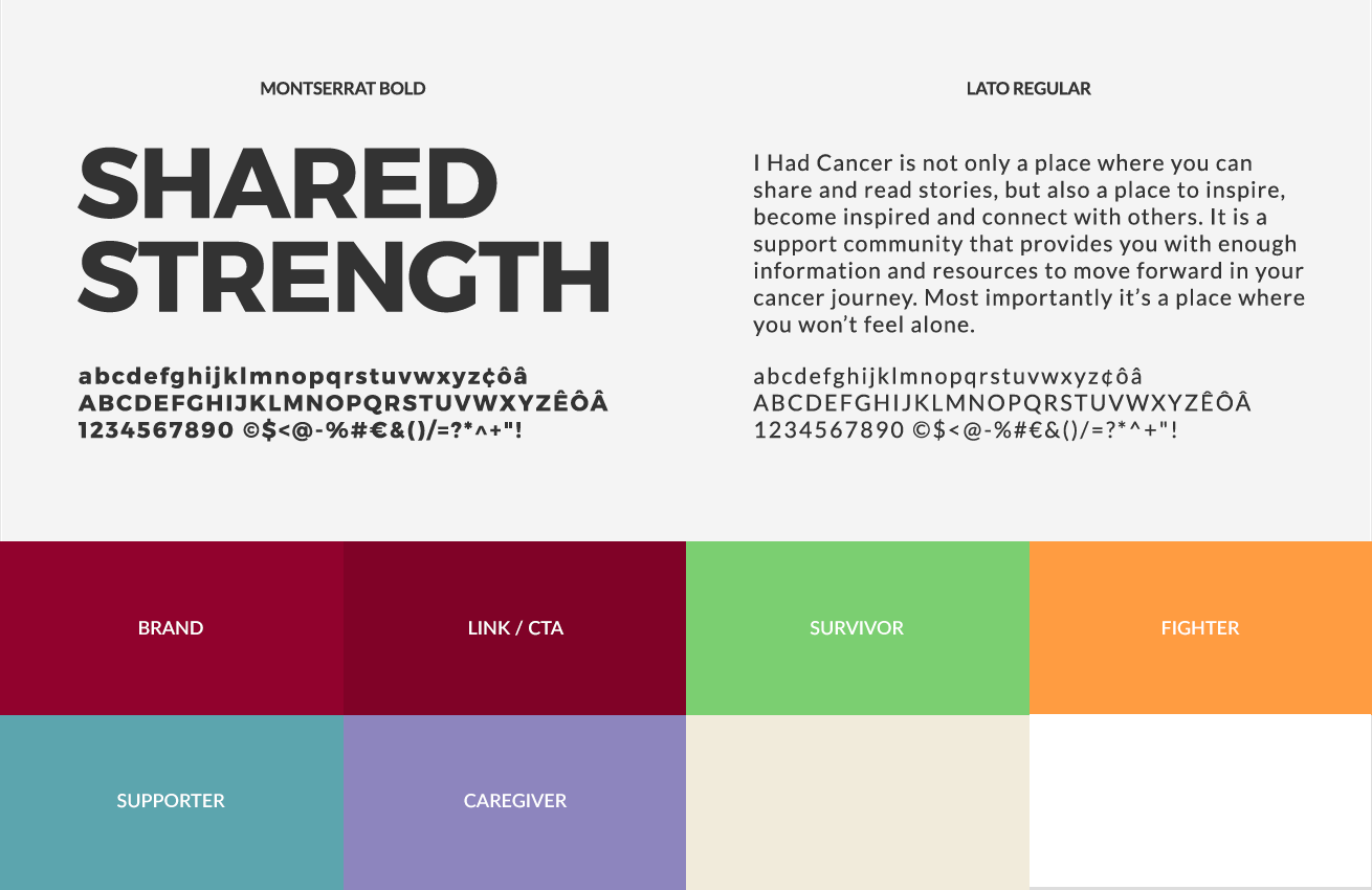
Keep icon and illustration simple and intuitive.
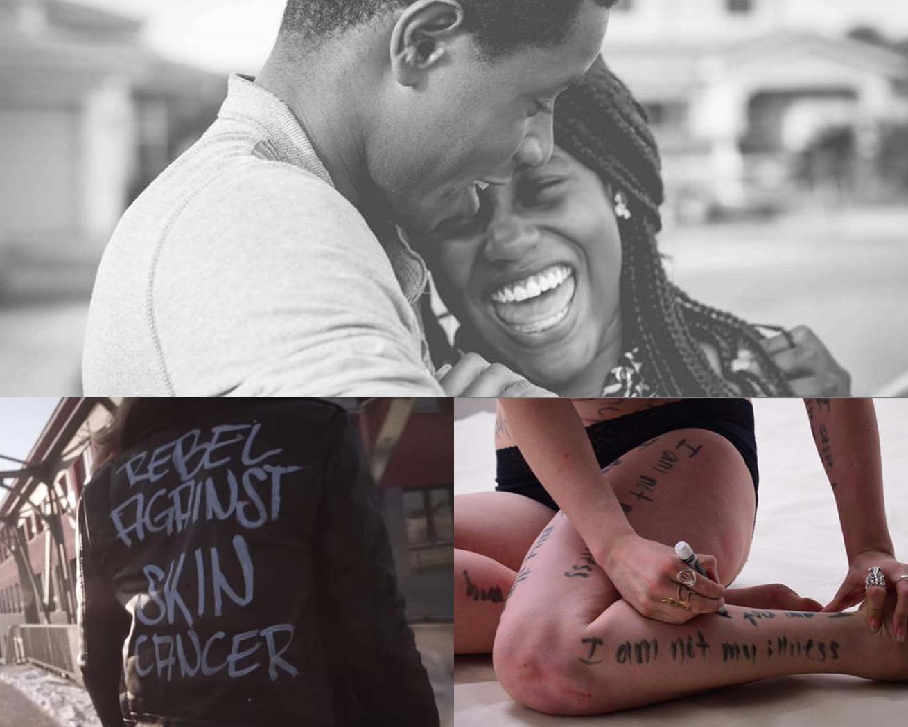
Warm, emotional, and authentic.
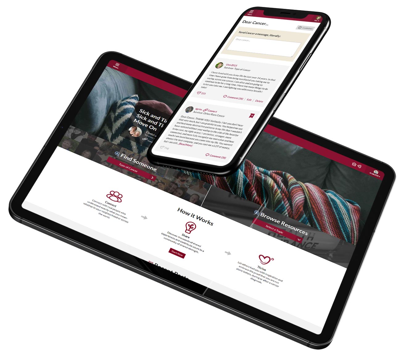
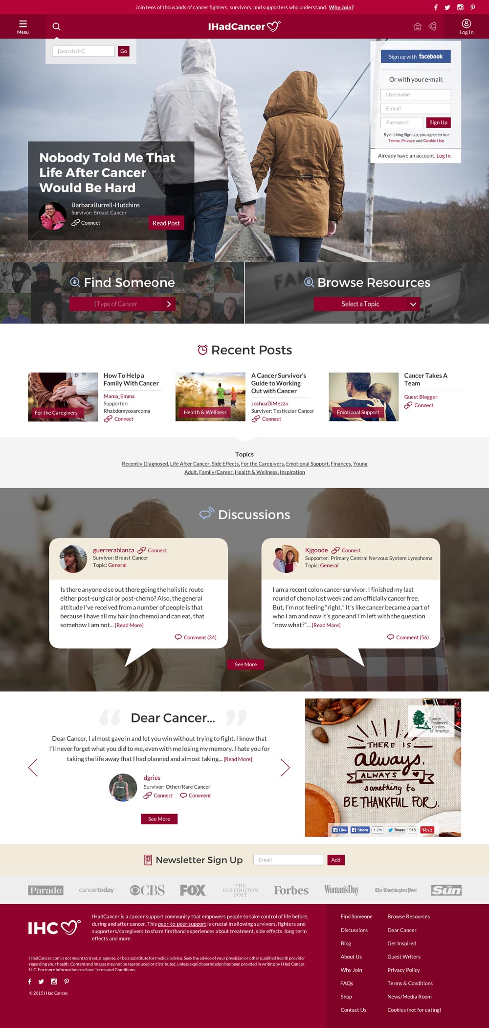
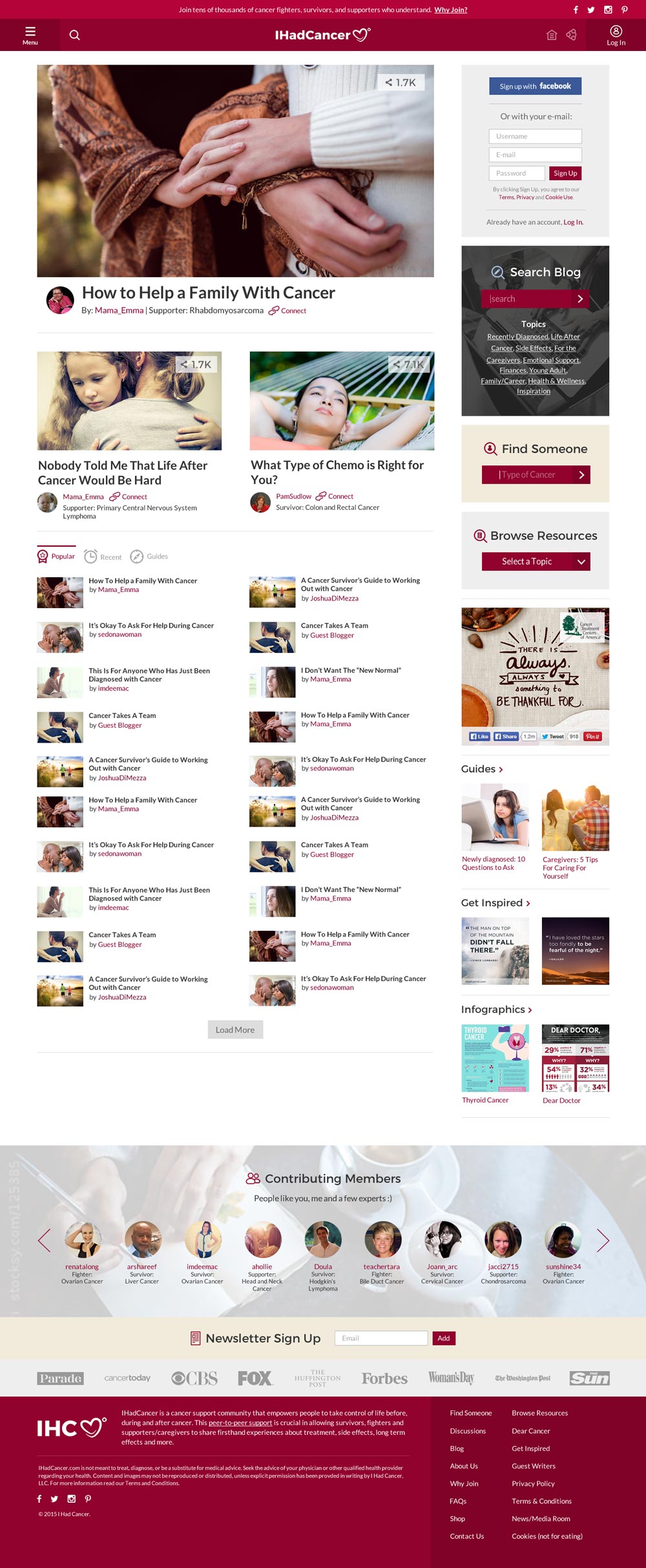
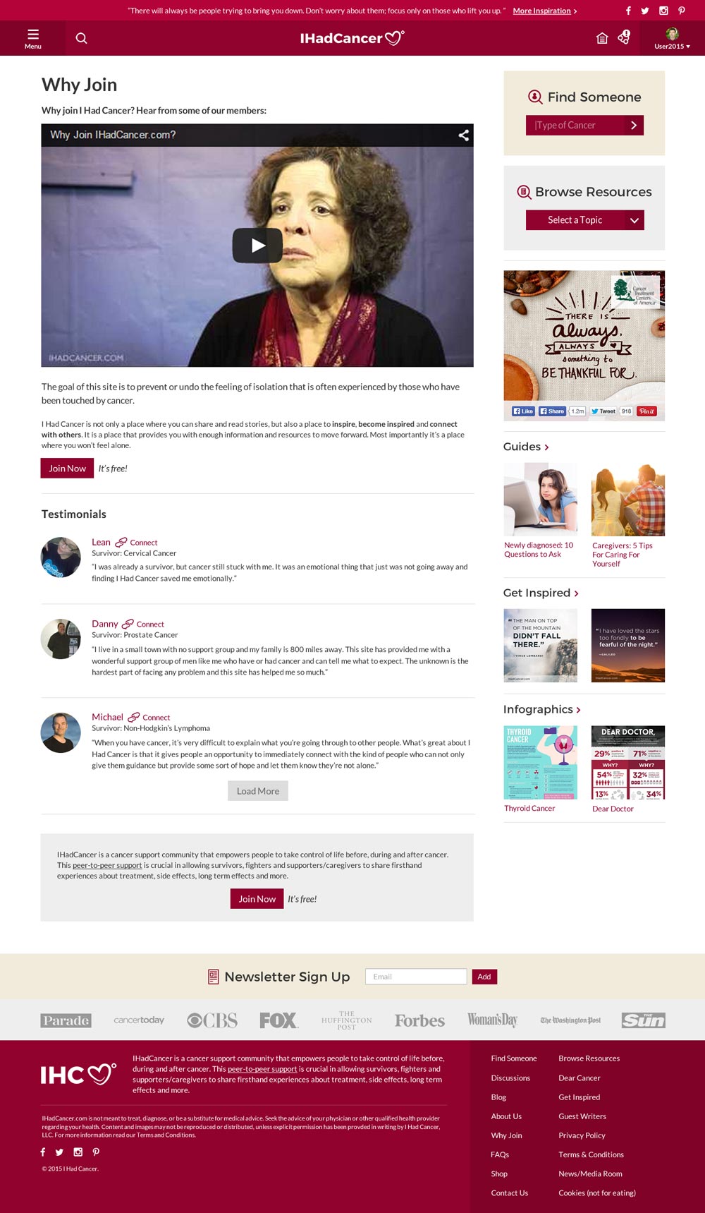
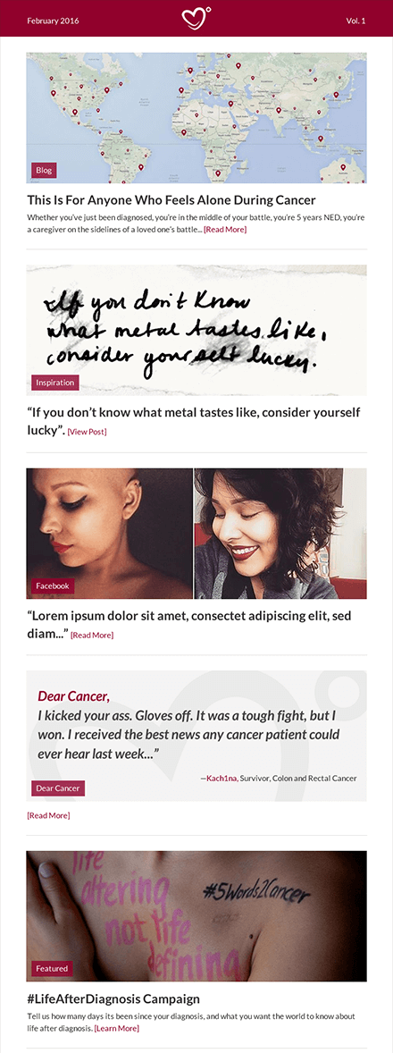
Because the highest engaging section over the platform is Blog, we make blog as a central content on the homepage to boost the engagement rate.

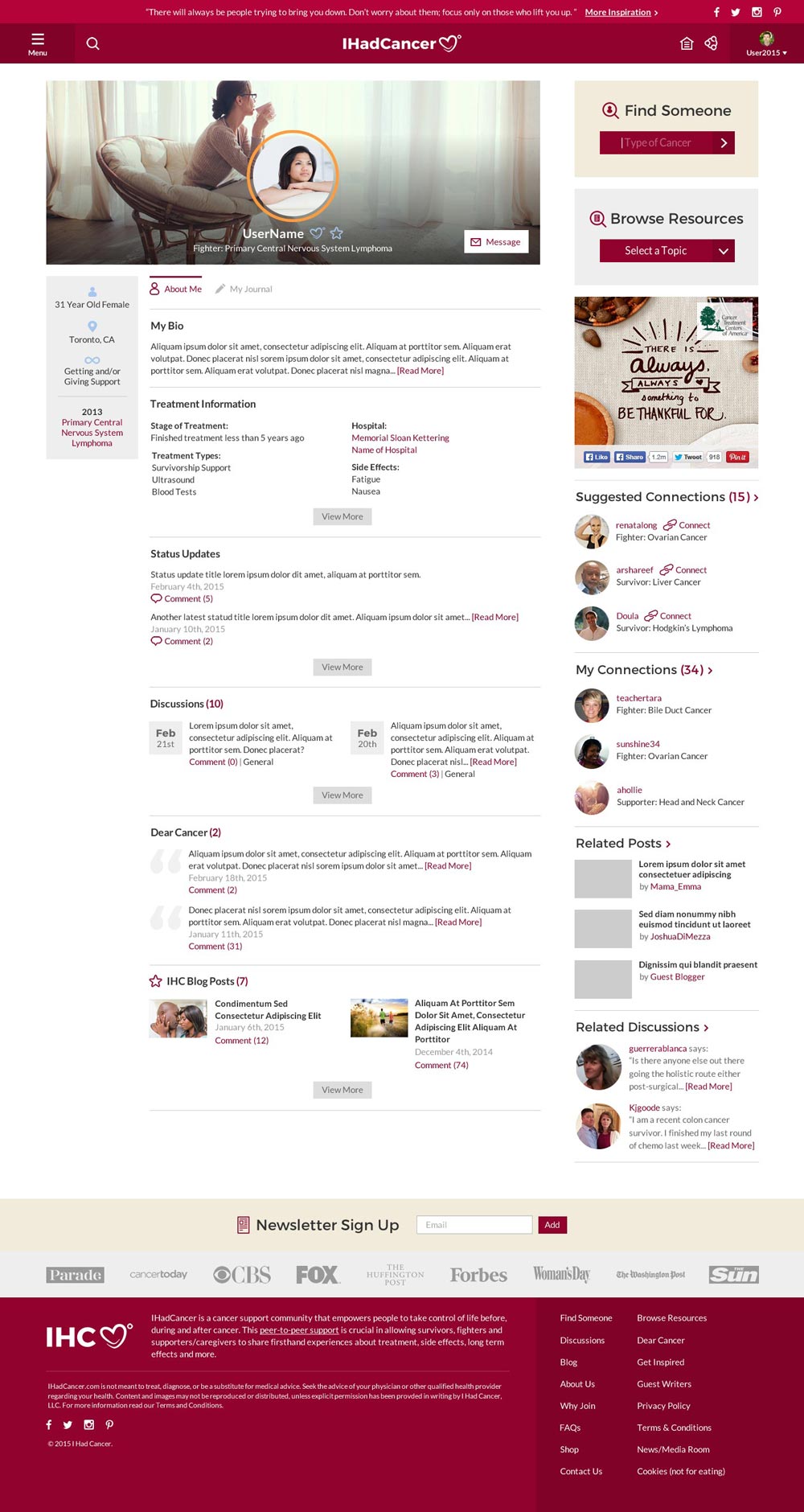
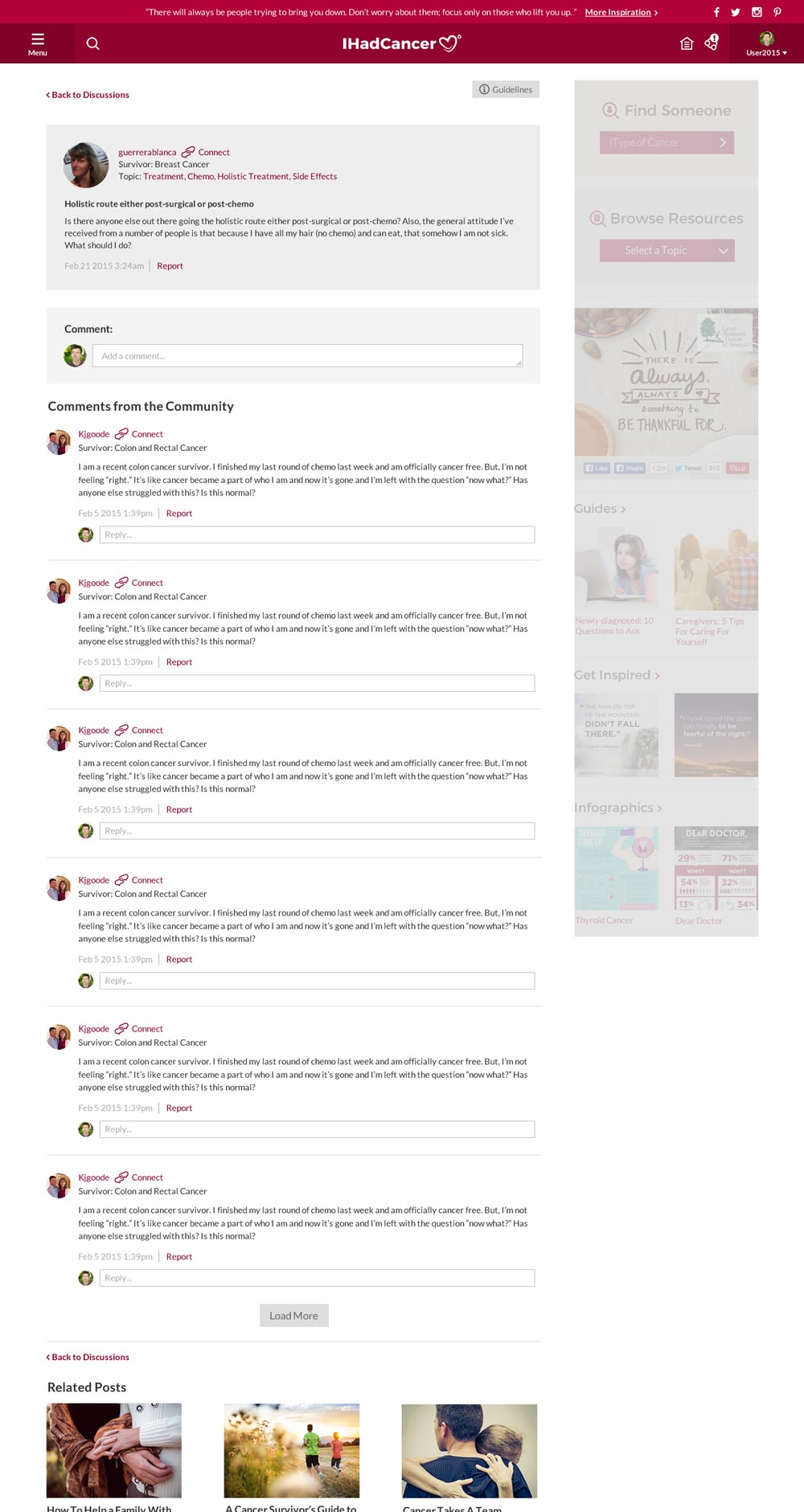
Keep encouraging users to connect throughout the site whether they like the same blog post or have the same type of cancer. When it’s connected, users can read profile info, send a private message, and get the updated status from each other.

Keep the registration process easy to follow to lower the drop out rate.

Users can customize their privacy setting from the Profile page.

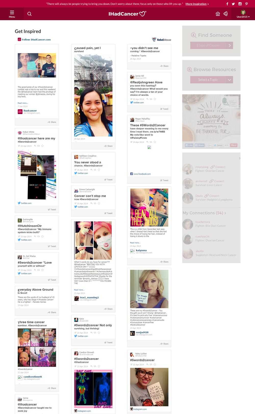
Up-to-date news from the topic and user you are interested in.

Take care of users 24/7.

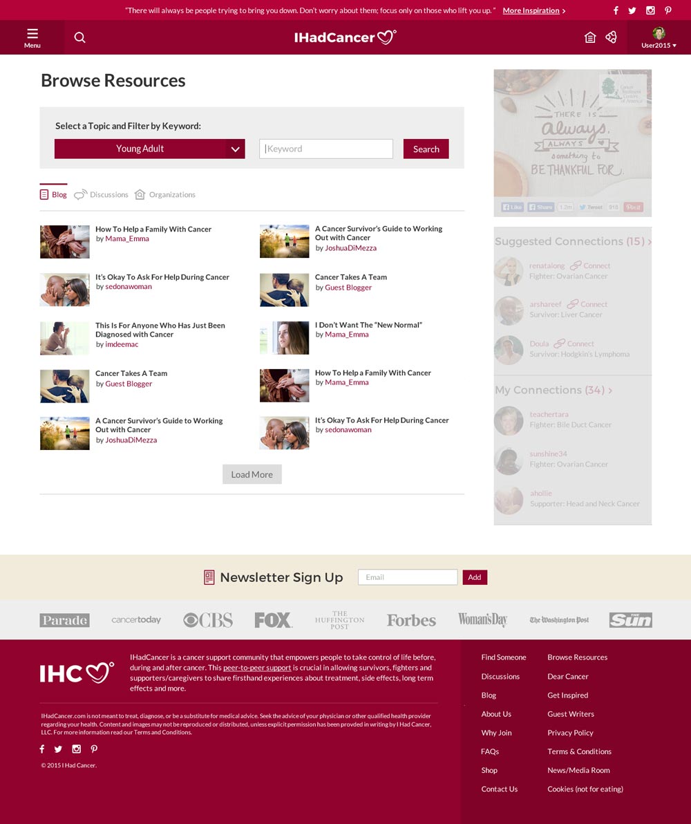
Categorize topics to narrow down the search results and organize results by key sections from the platform.

Use filter to find someone you may want to connect nearby.

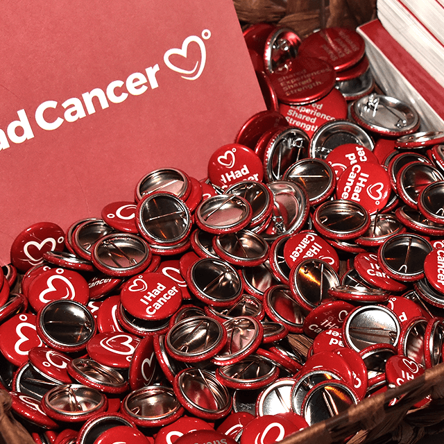
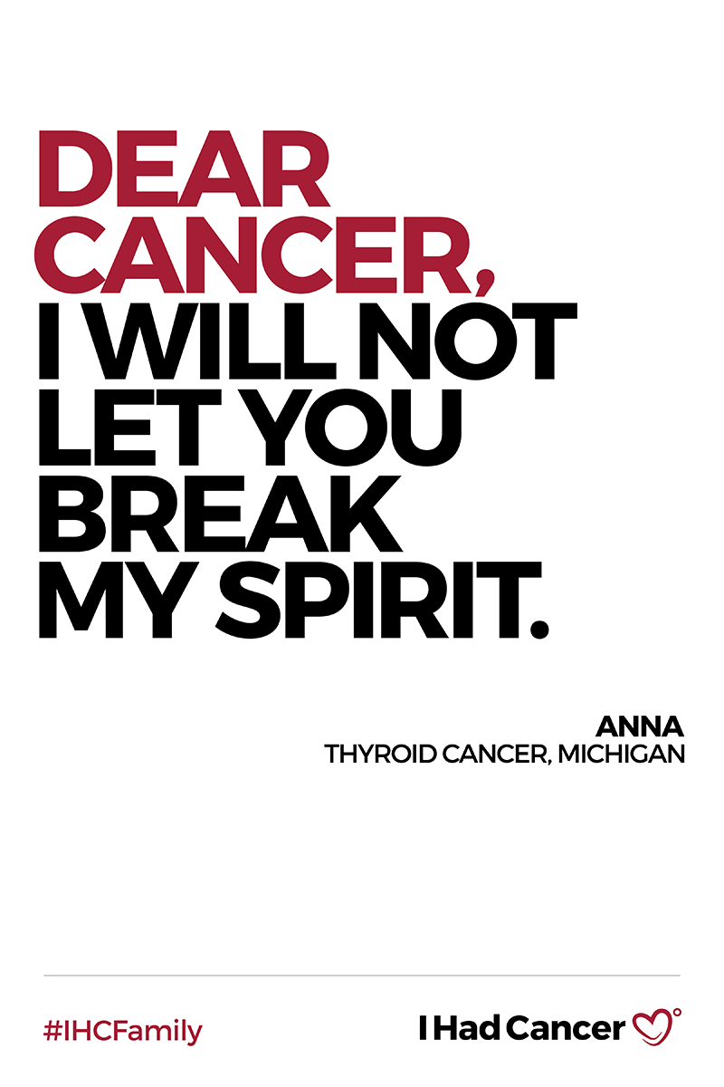
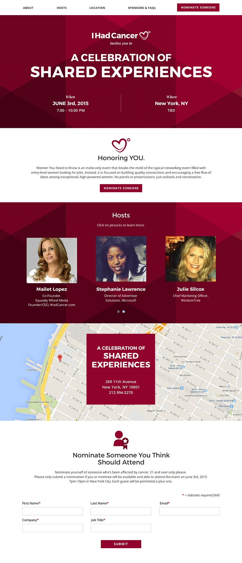
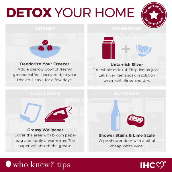
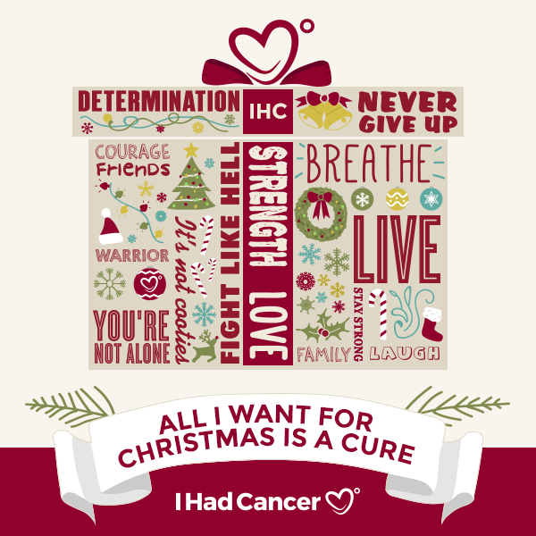
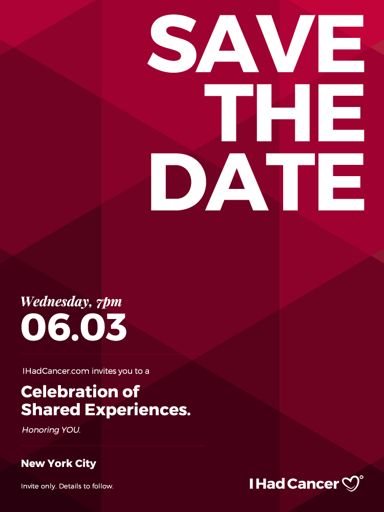
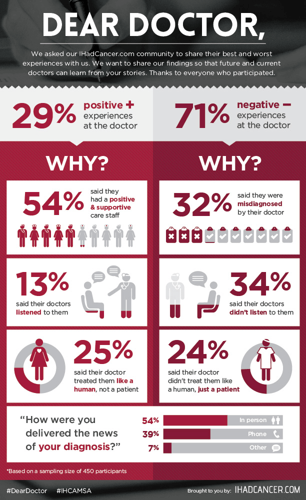
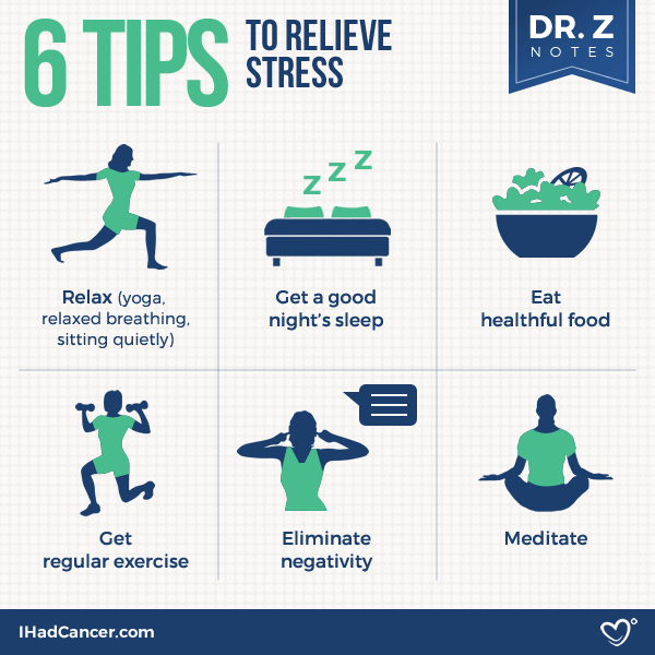
Infographics, Motion Graphics, Posters, Social Media, and Event Microsites.
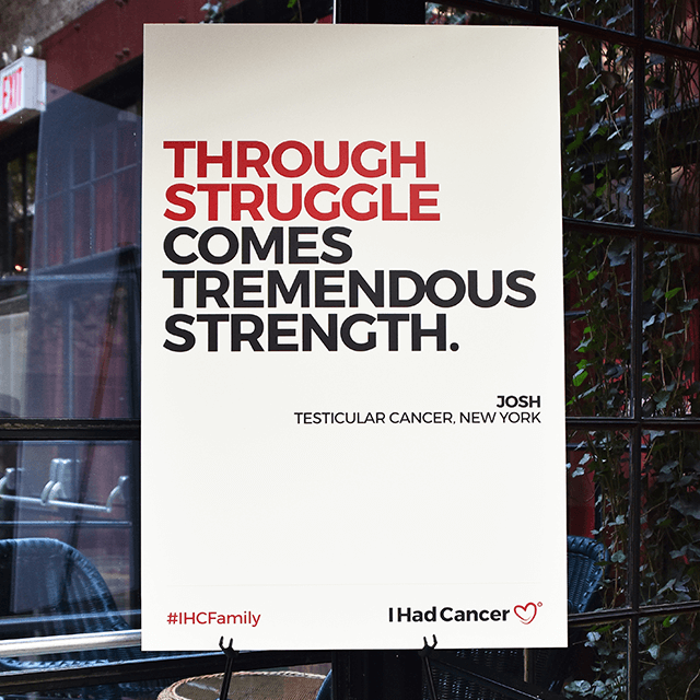
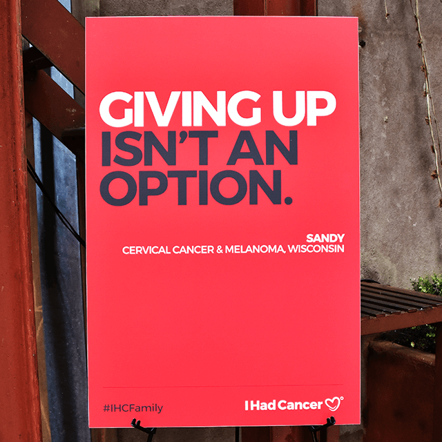
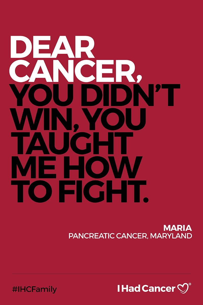
The Power of Connection.
Click on video to play.
Conscious Creative Movement.
Click on video to play.